Skip to content

Improving the navigation of
uSA Rugby to align with the users'
mental model

Abstract

USA Rugby is the national governing body for the sport of rugby in the United States, and a Full Sport Member of the United States Olympic and Paralympic Committee (USOPC) and World Rugby. 

USA Rugby was interested in improving the organization of content on their website to make it more linear and mitigate the current complexities in its navigation format. The broad term expectations of said re-haul would be to maintain retention of its current users while sourcing new users to engage with the website. 

Our user group is focused on the current members of the website, so our findings and recommendations are based on enhancing the existing user experience on the platform. Our objectives are based on identifying points of optimization from a user behavior perspective and providing recommendations in terms of improving the accessibility of the website content. We used Hotjar and Google analytics to analyze the website engagement data and used Google Drive to collaborate on the work as a team. We derived findings based on the navigation, content and visitor analytics of the website and crafted recommendations accordingly.

Team

Jessica Drozd

Shadiya Fairoose

Jun Kok

Zhichun Zhao

My Role

  • I helped collect and analyze the website engagement data using Google Analytics and Hotjar 
  • I contributed to the recommendations and findings derived from our analysis
  • I contributed design and content work for the client presentation deck
  • I was one of the presenters of the consolidated summary of our teams work to the client stakeholders

Analyzing the data using Google Analytics and Hotjar

Google Analytics

Hotjar

Data Analysis

We used Google Analytics to compare the data over two time frames, Aug.18, 2021 – Feb 18, 2022 and Feb 14, 2021 – Aug 17 2021, to find any possible trends and anomalies. We compiled all our individual analysis to a Google doc and we were able to collectively derive inferences. Our focus was mainly on user behavior, navigation flow and understanding from where the visitors were coming from and how they reached the website. We used Hotjar to observe the recordings, moves, and heat maps to see how far users scroll. We also paid extra attention to membership pages as our user focus was members.

We mainly focused on our five research questions and based on that we found our findings and recommendations. 

  • How do visitors navigate to the membership page and related content?
  • How do visitors’ navigation patterns differ between desktop and mobile devices?
  • What membership-related content is most popular with website visitors?
  • What are some of the key characteristics of members visiting the website?
  • What are the traffic sources from and to the membership pages?

Challenges faced by the team while analyzing

1

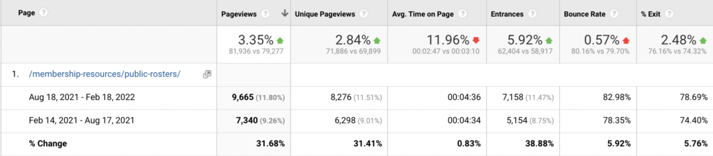
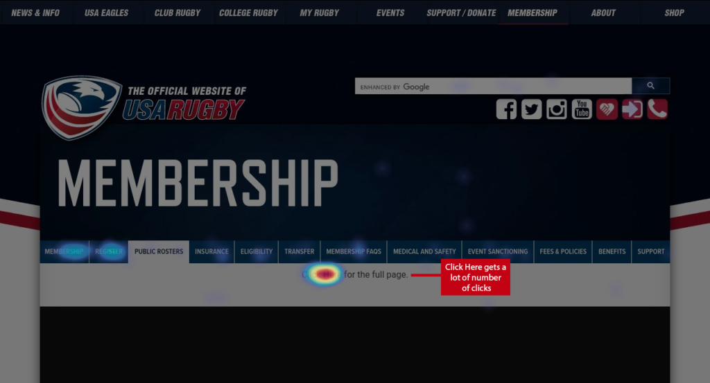
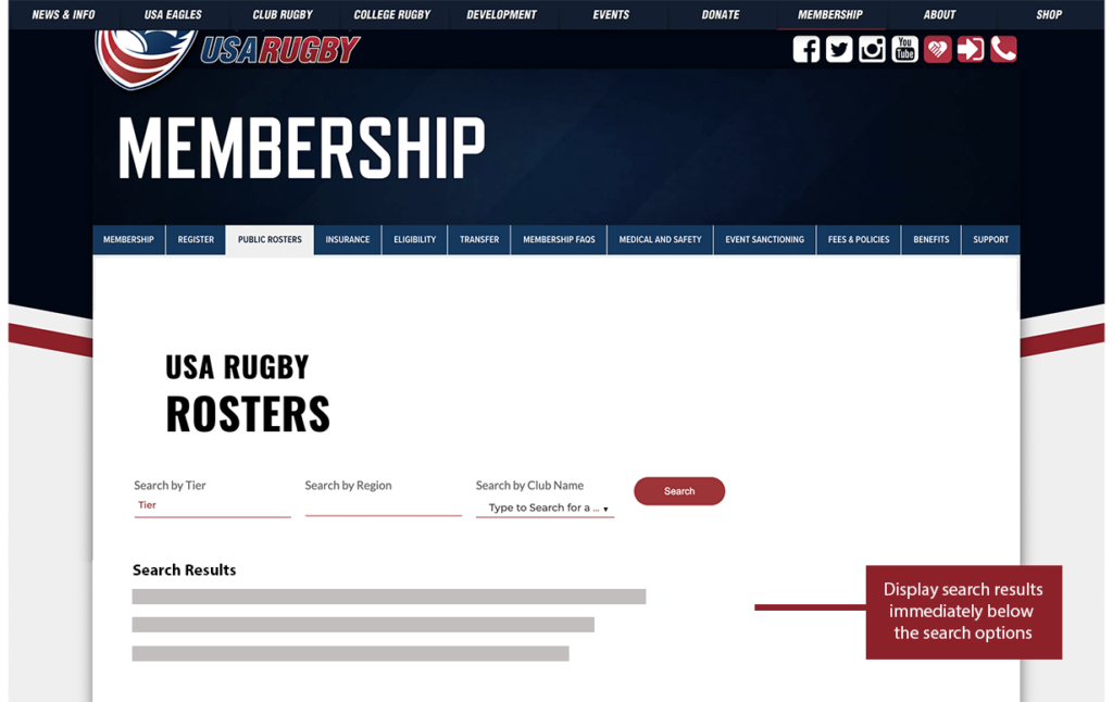
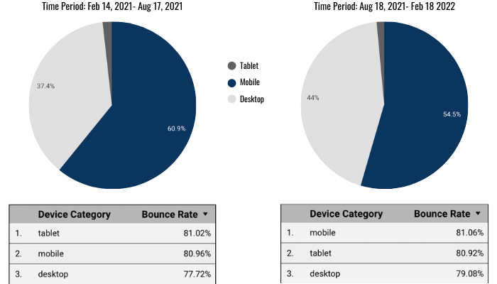
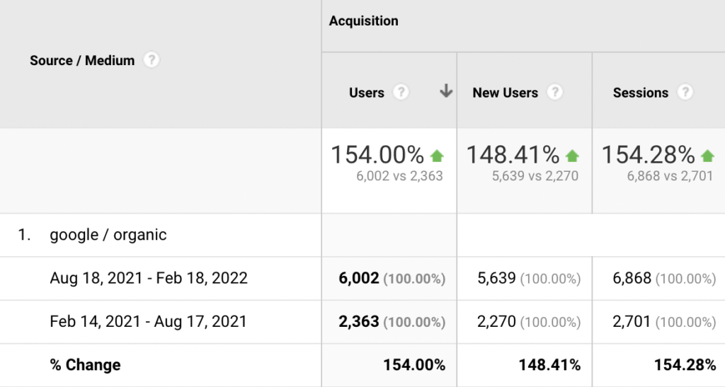
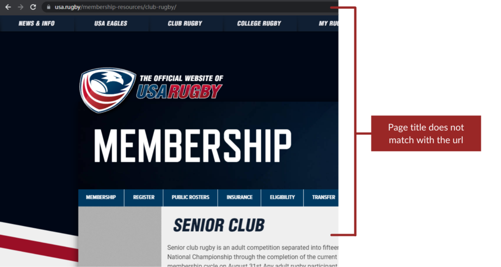
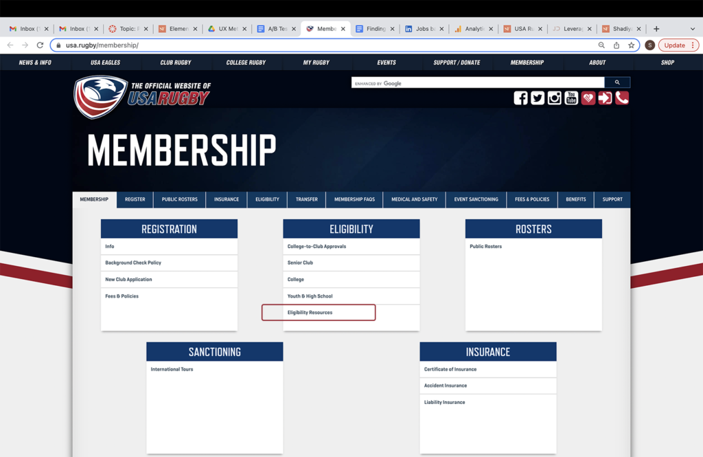
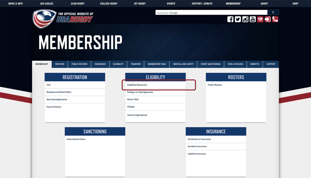
Event Tracking Not Activated

Event tracking is crucial since the data provided helps to record interactions with elements of the website for better conversion. This, in turn, means more sequential information regarding whatever action you're trying to generate.

2

data Understanding on Hotjar

Since majority of the team had not used Hotjar prior to the project, it took time to understand the various data points and their relevance to finding patterns of user behavior.

Overall Findings

On a high level, the website is performing well with great interaction numbers on membership pages. Out of the 10 most viewed pages, 6 of them are membership-related pages. The website was also able to increase its sessions, durations and page views across the two time period indicative of increasing popularity. We focused our study on three main areas of the website, that is Navigation of the website, Content and Visitor Analytics. Concerning the navigation of the website, we found some areas for improvement like set methodologies for reducing the number of clicks and proposals to improve mobile and desktop engagement. We also provided suggestions on how to prioritize the membership page content, as the related menu section has the most highest views as per the analytics. Last but not least, we also found insights into how organic search can be utilized to improve the visibility of the website over search engines.

Navigation

Content

Visitor Analytics

Identifying The Navigational Behavior Of Users Across The Membership Page

Finding 1: Over 70% of all are landing on the Public Rosters page

The Public Rosters page has the most viewed sessions among all the membership pages but it also shows wavering engagement comparatively.  The page views has increased over the two time periods (31.68%) and data also shows increased unique page views (31.41%). However the data confirms that the bounce rate has increased slightly during the second half of 2021 (5.92%) as well as an uptick in the exit rate (5.76%). The data is indicative of users seeking roster details but having difficulties in finding the exact information they need in a quick manner and therefore exiting the page.

The Hotjar data showed a clear monopoly of clicks for the ‘Click here for a full page’  button among other elements. However once you click it, it takes you to another page with the same content and options, just more bigger and well spaced, which feels redundant. The main reason is the inefficient display of the search results on the same page.

Recommendation: Reducing the number of steps involved in finding the desired information

Optimize this page by reducing the number of steps a user has to take in order to get the information they need.  

One way would be to display search results in a clear and easy to scroll manner immediately below the search options, instead of having the user click on the link to view the full page of the roster.

Current Version
Mock-up Version

Deciphering the visitors’ navigation patterns among desktop and mobile devices

Finding 2: Falling average session duration metric linked to desktop users

Average session duration for desktop users has gone down by a large margin between the two time periods  which indicates that engagement over the desktop platform has reduced. At the same time, average session duration for mobile users has remained consistent

Recommendation: Set up interactive elements on the web page

Add interactive elements like a poll/trivia widget about popular players. This will help in providing an outlet for engagement on the page. The poll could be a fun short interactive session for the users, the page could also incorporate links to the relevant pages like to the players page or membership pages.

Current Version
Mock-up Version

Finding 3: Higher user count for Desktop & lower user count for mobile in later period

The new user count has increased for the desktop (19.16%) across the two time periods while it has reduced for the mobile site (-9.38%). Bounce rate is also high.

In the video we can see that the user keeps traversing back and forth in the menu section as if they’re looking for something in the mobile version. Perhaps they’re simply browsing but it would always be more convenient if the information is made easier to for the user to get access to. From the heat map image, we can see that people engage with menu option and news options to a large extent, possibly looking for information tags. One key difference between the desktop and mobile version of the site is the lack of a search bar on the home page on the mobile version.

Recommendation: Incorporate search bar as an embedded element on the homepage

Site visitors should have access to the information they need within 2 or 3 clicks. The most ideal way to incorporate this would be to have a search bar embedded on the homepage that is distinctly visible to users. Currently the search bar is present within the side menu and it only returns information relating to the menu options and not about the website content.

Reviewing the popularity of membership-related content among website visitors

Finding 4: Membership related pages have the highest page views

 6/10 pages that have the highest page view are membership related pages. From the below images we can see that users view normally stays within the top part of the page without scrolling further, but at the same time a lot of clicks are happening on ‘Register’ buttons and ‘Info’ button. 

The whole page content setup can be confusing with some of the elements having links and some of them not.

Recommendation: Content Reorganization to remove redundancies

Content should be reorganized and reprioritized. Some easy to implement avenues include removing the card style layout for a better spaced format. It’s important to not overwhelm users with options so the content should be streamlined to only include relevant topics such as benefits and general info. Public Roster can be set up as a different tab. The Register button is highly used so it should be made clearer and placed before the fold.

Current Version
Mock-up Version

Gauging the traffic trends surrounding the website

Finding 5: Traffic from organic search might be underutilized. 

From the below snippet, it is quite evident that there’s a big increase in organic search for new users. It is critical that such an increase should be sustained through efficient Search Engine Optimization (SEO) tactics. 

SEO is based primarily on the tags and URL verbiage associated with the website. There are cases within the USA Rugby pages where the URL does not align with the page content which could lead to bad data collection.

Recommendation: Align URL verbiage with page content

Make the URLs consistent with page headings. This makes it easier to identify a page with its content from a search engine perspective,

So How did we get the word out?

As a group, we created a detailed presentation on the analysis process and the final results. The presentation can be viewed here.

This was presented to the clients over a Zoom meeting by the four of us, with some time for Q&A after.

The results were also created in a One-page visual summary. This can be viewed here.

What Were The Constructive Lessons I Learned From The Research?

I came into this project with only a basic working knowledge of user experience analytics and its related tools. Working through the various phases on the project, I was able to gain some insights into the process of optimizing a website from a quantitative and qualitative standpoint. 

I was surprised to see how engagement numbers can be used to visualize a pattern in user behavior. I have a beginner proficiency in Google Analytics and the statistical data used to seem daunting, but this project experience helped me understand the metrics to keep an eye out for. Hotjar was a relatively new tool for me, but I was able to understand its impact and value in such a study. By reviewing user behavior, I was able to decipher patterns and causes that would’ve been hidden in plain sight.

Some questions I pondered during the project tenure:

  • How much data is enough for the analysis?
  • Do the insights and issues I identified make sense in the context of the scope of the project?
  • Am I looking for problems that do not exist?


Finally, I found that an empathetic understanding of the user is critical to deriving useful findings from the vast data available to us. I will only be able to help the user if I can think like a user.


So how do we move forward to maintain consistency in user engagement?

First step is to overcome a major weak point in the website analytics mentioned earlier. Event tracking needs to be set and interactions need to be tracked. This is imperative. 

Ideally, we want to know how the recommendations would affect the website’s engagement. This can be achieved through an A/B test which would employ a null hypothesis in favor one of our recommendations and conduct a controlled test to see if the identified trend is optimized.

For example, a possible hypothesis could be,

Moving the “Eligibility Resources” to the top of the “Eligibility” tertiary navigation menu will result in increased traffic for “Eligibility Resources” page.

How did the client react?

The client was satisfied with our findings and recommendations. They said the insights would definitely help them in the website redesign process in the future. They mentioned that they had awareness on a few of these issues and were satisfied that it had been confirmed by a third party.  Overall, the client feedback was very favourable and were in line with our goals as a team.

More Case Studies