10-4 by WEX: Designing a trucker's co-pilot for fuel savings
About 10-4 by WEX
For independent truckers and fleet managers, fuel is the single largest operating expense. The “10-4 by WEX” app is a financial technology solution designed to directly address this pain point. It provides truckers with exclusive access to a nationwide network of fuel stations, offering significant discounts to help them save money and streamline their operations. The project’s goal was to create an intuitive, reliable mobile experience that makes finding and paying for discounted fuel effortless.
Through a deeply collaborative process with product and engineering, and multiple cycles of user-driven iteration, we launched a feature that is now used by 95% of active drivers.
My role
Co-Designer (UI/Visual focus)
Timeline
Jan 2024 - Ongoing
Collaborators
Lead Designer UX Researcher Product Managers Developers
My collaborative contribution
Diving deep into user pain points by analyzing usage data and partnering with our UX researcher to synthesize feedback.
Conducting competitive analysis for key features to identify industry best practices and opportunities for innovation.
Translating research findings and user needs into initial concepts, user flows, and wireframes to explore and validate design solutions.
Collaborating closely with the lead designer to evolve these research-backed wireframes into polished, high-fidelity visual designs.
Presenting UI mockups and prototypes to design, product, and development teams to gather feedback and drive alignment.
The challenge: Easing the financial burden for America’s truckers
Through conversations with long-haul truck drivers, we discovered their current process for finding the best fuel prices involved manually checking multiple apps, relying on word-of-mouth, or taking costly detours based on outdated information. This process was a significant distraction from driving, rarely guaranteed the best price, and created constant uncertainty about their biggest operational expense.
Process
Collaborate
Competitive analysis Market research User interviews
Design
User flow Information architecture Medium Fidelity
Iterate
Style guide Figma prototype Design handoff
The Goal: A seamless journey from discovery to discount
Our objective was to design a mobile-first experience that would become an essential tool for every trucker. We aimed to create a product that was not only visually appealing but fundamentally simple, guiding the user from finding a station to completing a discounted transaction with minimal friction. We set the following goals to measure our success:
Achieve task success rate for fuel purchases
0%
Achieve adoption rate among active drivers
0%
Average time on task completion
0s
How might we
Design a mobile experience that empowers truckers to instantly find and redeem fuel savings, making the process so simple that it becomes an indispensable part of their daily routine.
In a truck cab, simplicity is paramount. The interface needed to be scannable at a glance, with clear calls-to-action and no room for ambiguity. As a co-designer, I worked closely with the lead designer to execute a visual strategy centered on clarity.
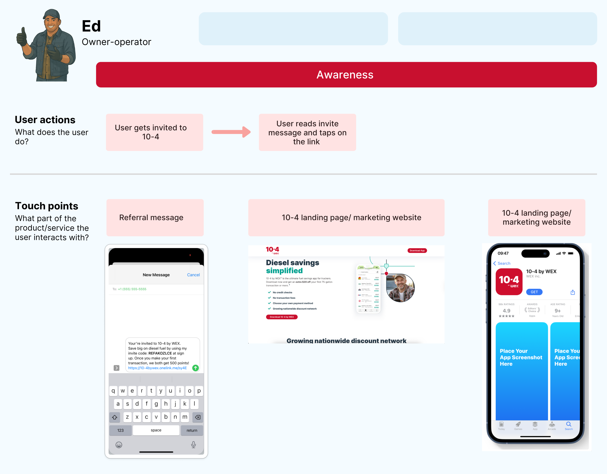
Ed learns about the app via referral, website, and app store
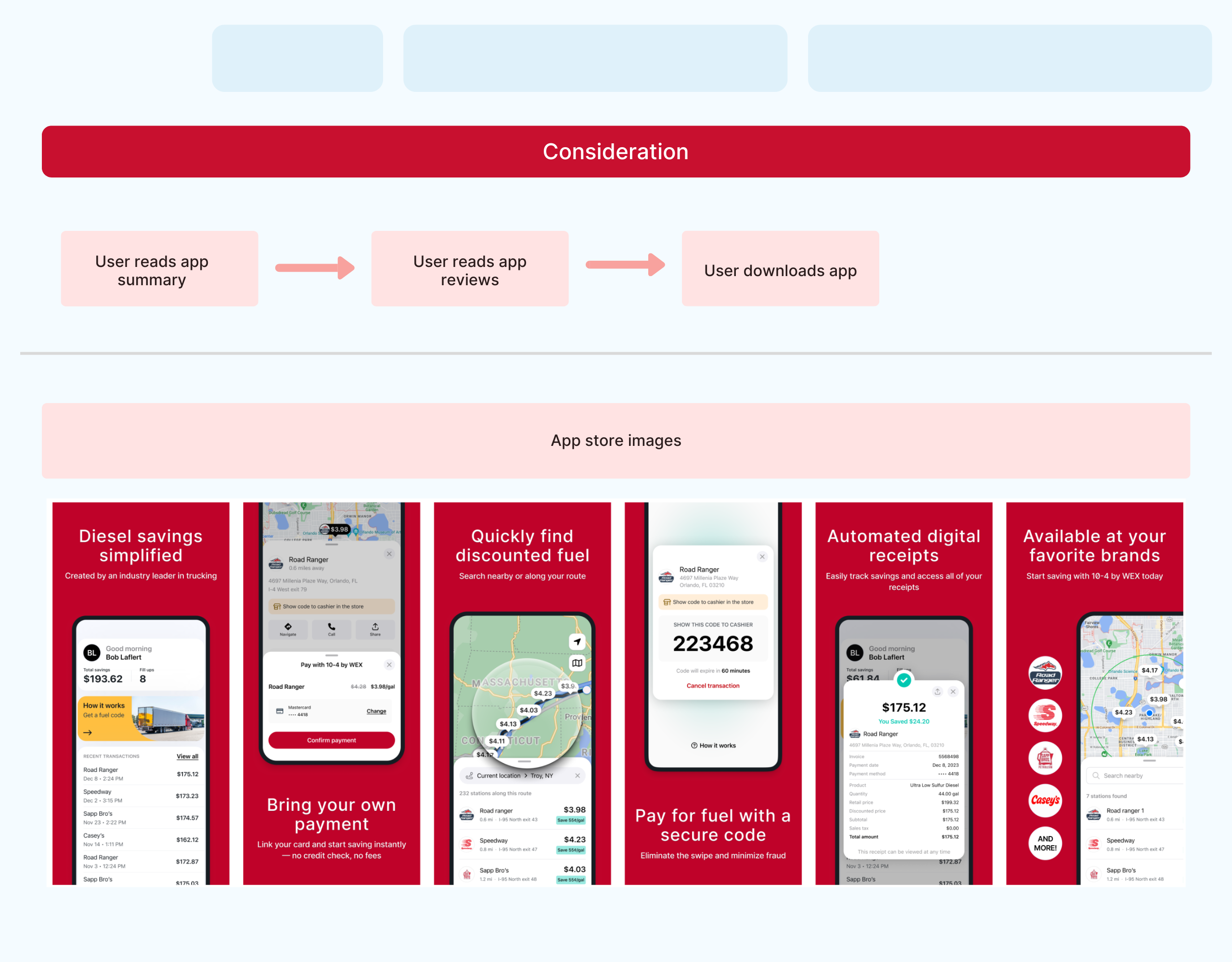
Ed reviews app features and downloads it from the store
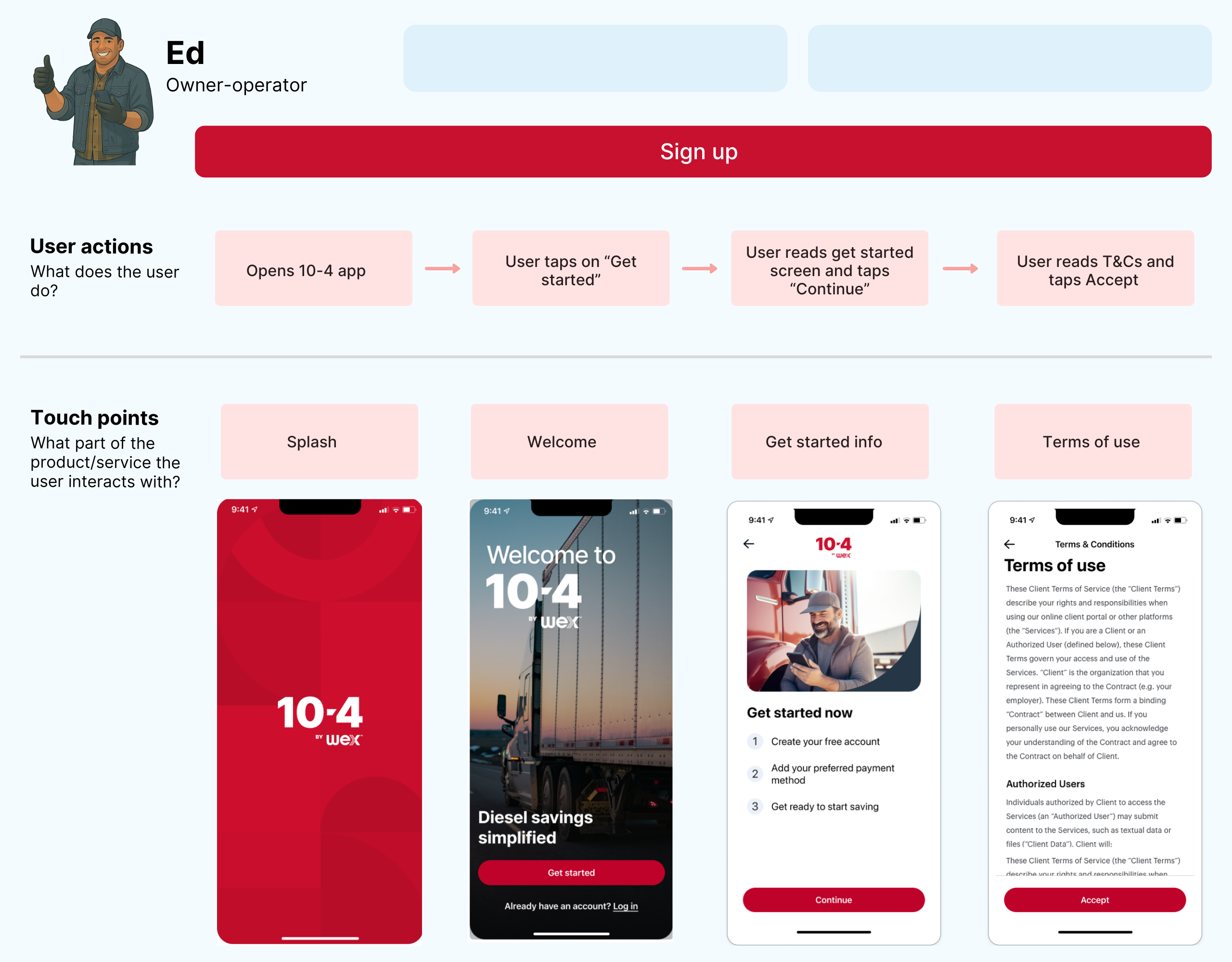
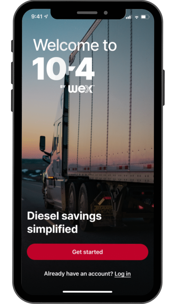
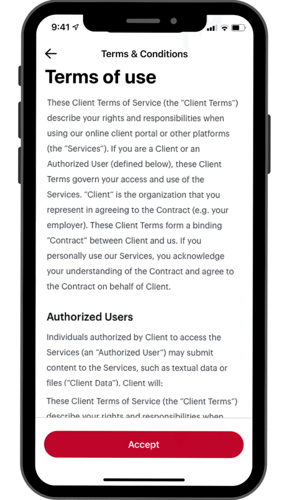
Initial app screens, welcome, and acceptance of terms
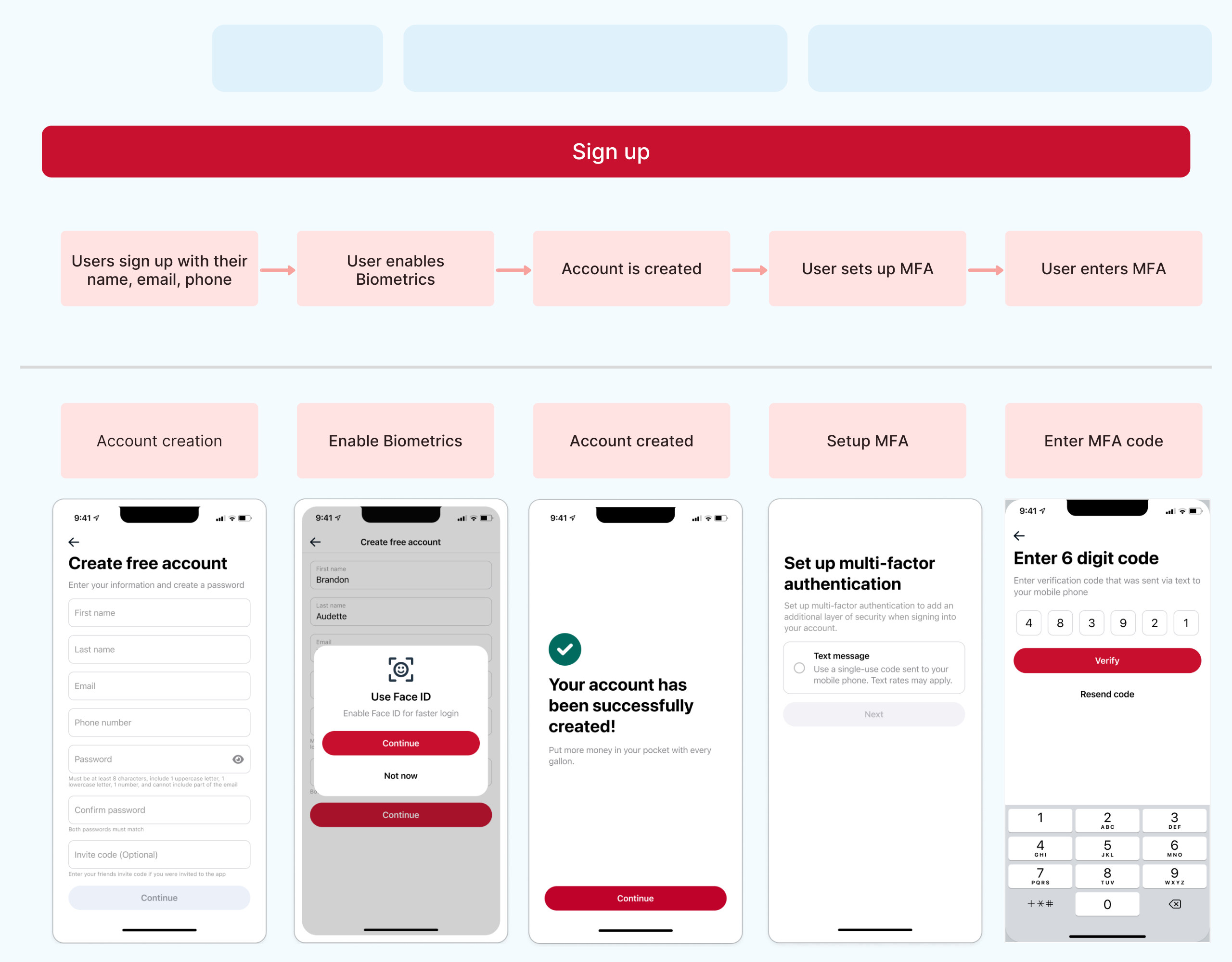
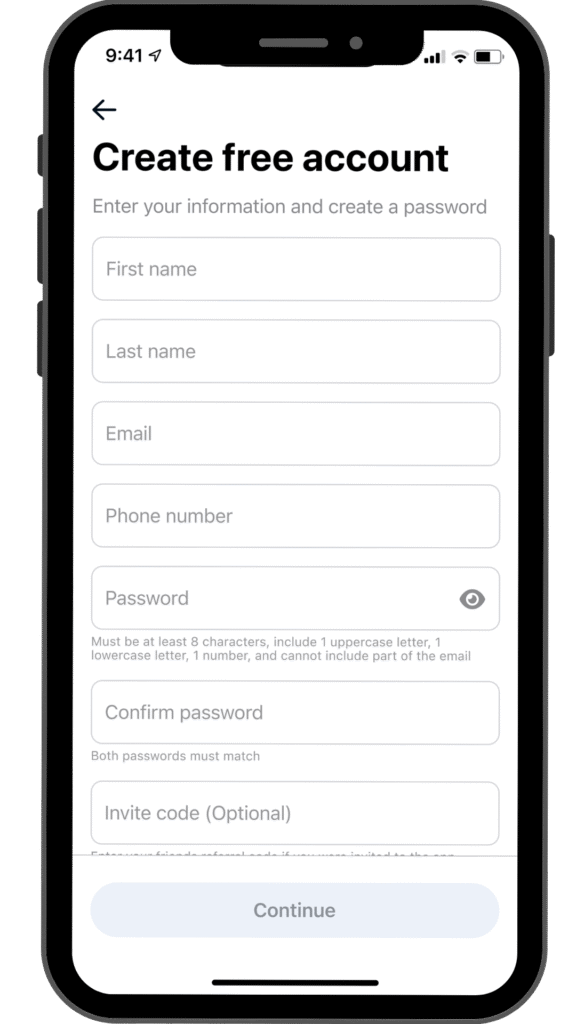
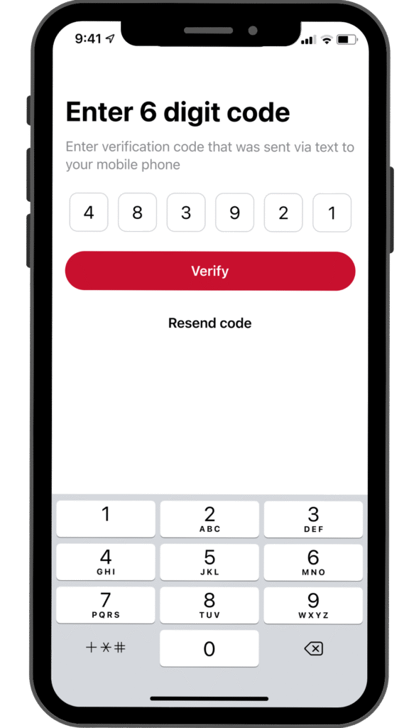
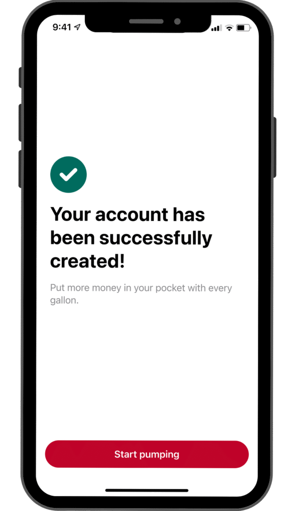
Ed creates an account, enables biometrics, and sets up MFA
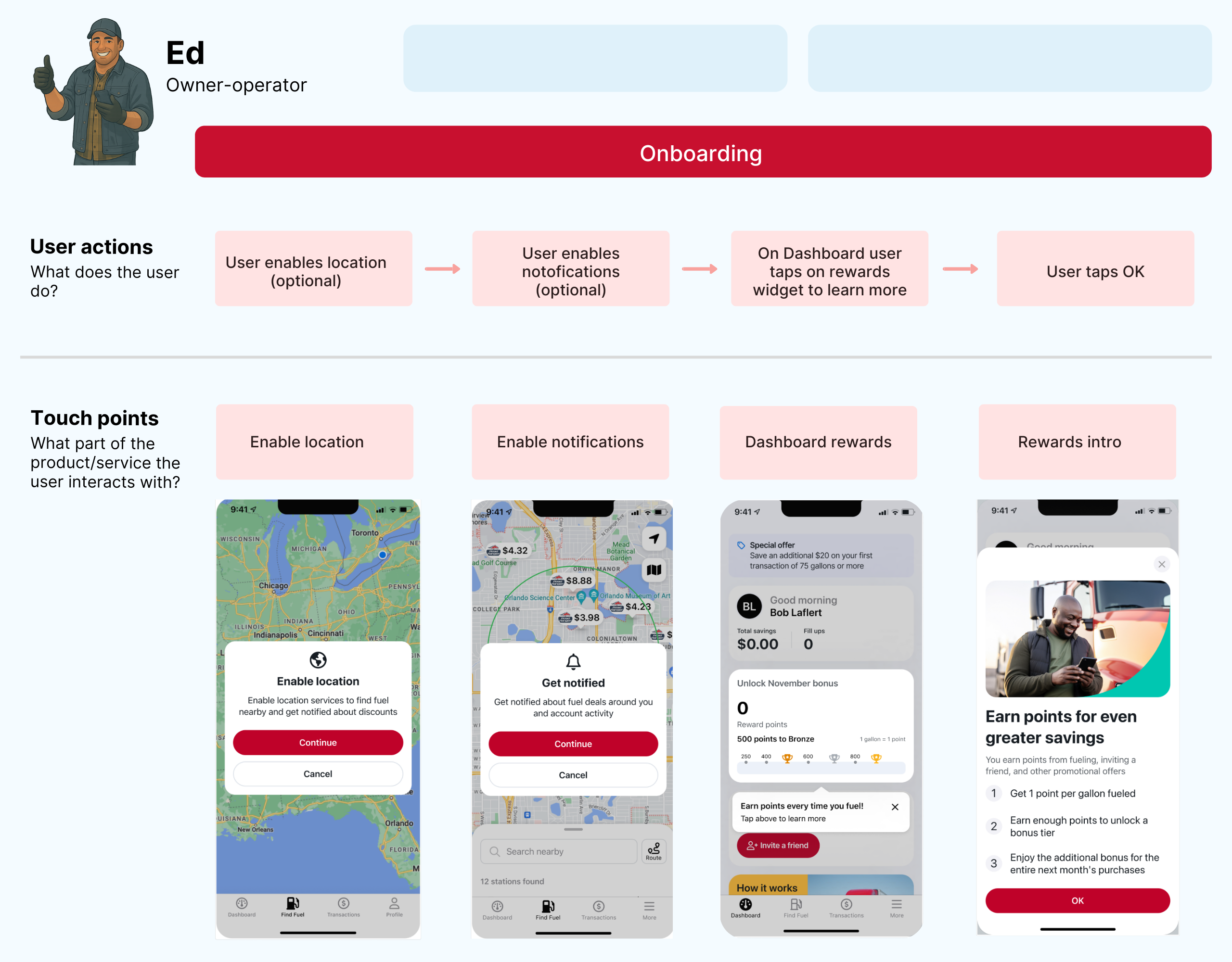
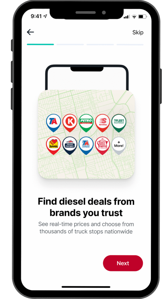
Ed enables location/notifications and explores rewards
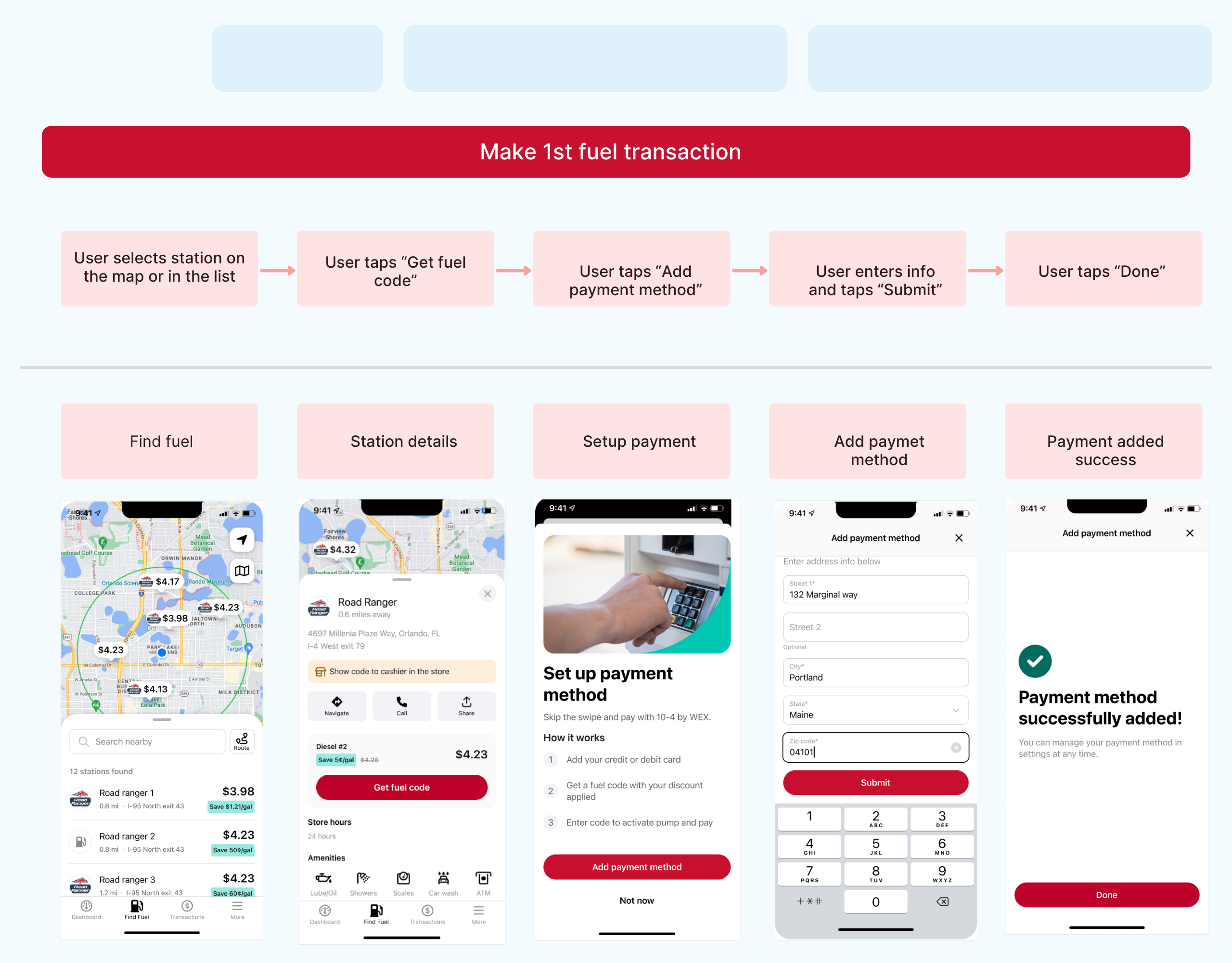
Ed finds a station and securely adds a payment method
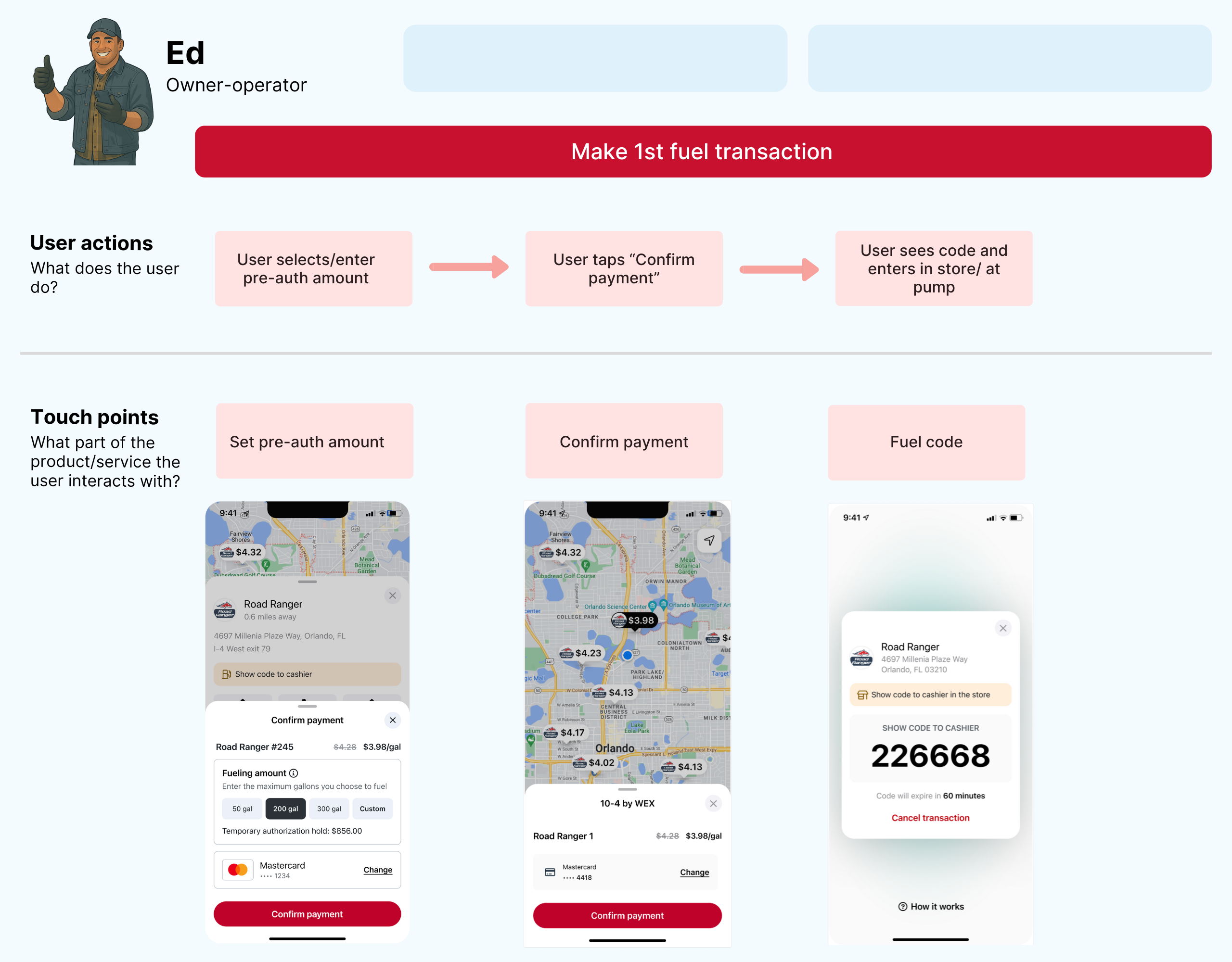
Ed authorizes payment and receives a fuel code for the pump
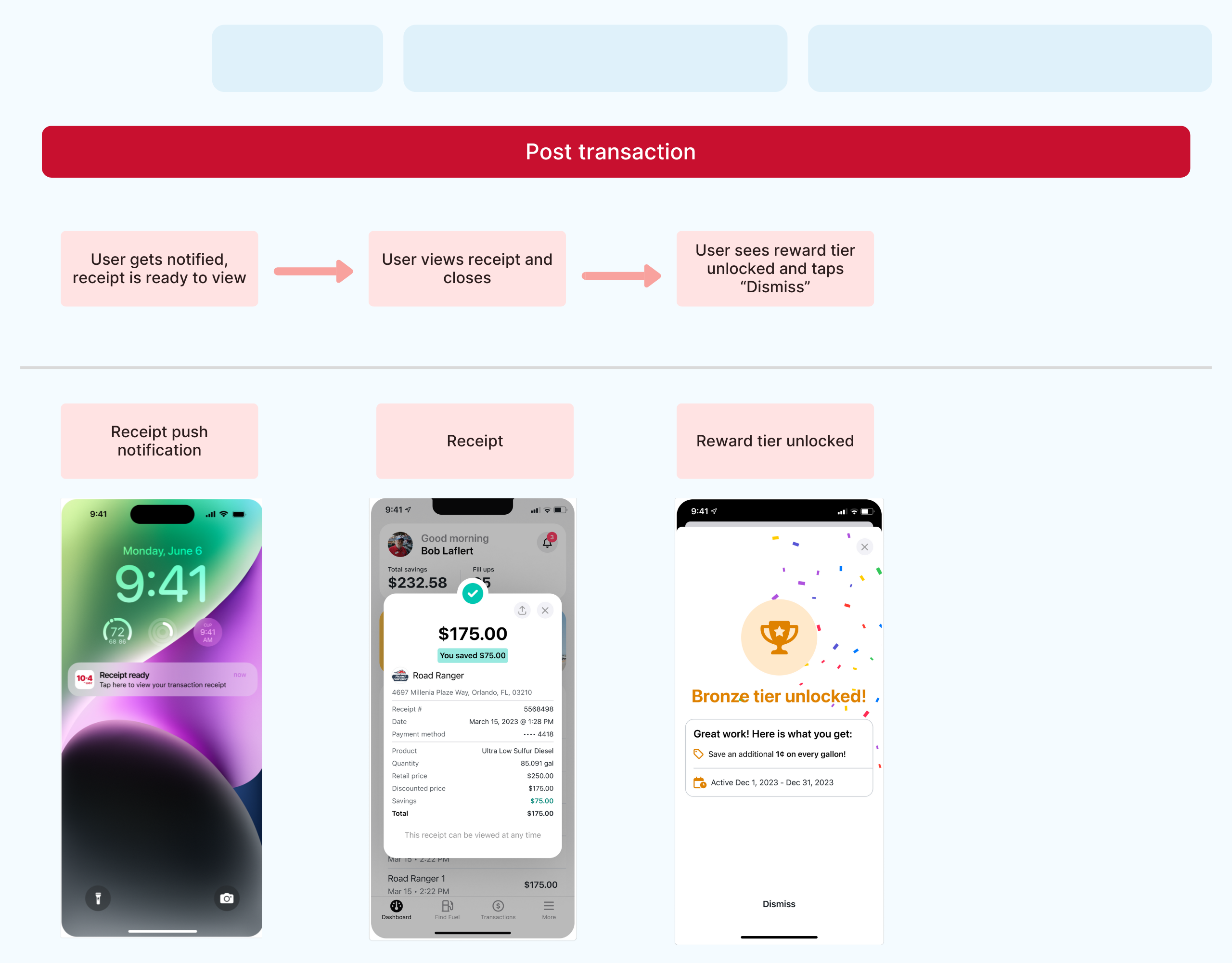
Ed receives receipt notification, views receipt, and unlocks rewards
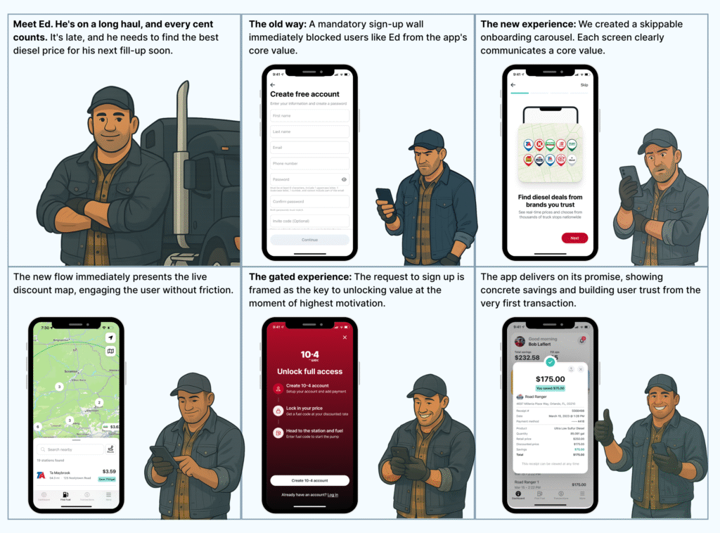
Iteration in action: The “Fuel first” onboarding shift
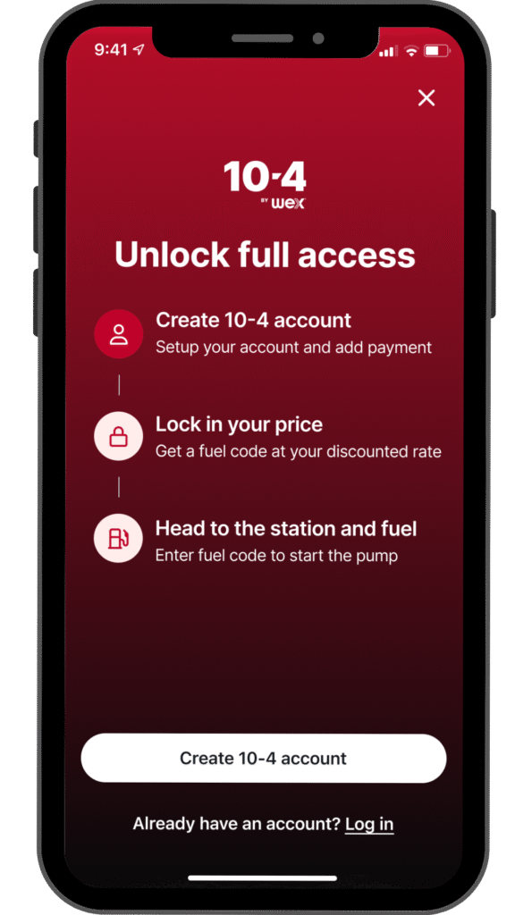
Our initial onboarding was a barrier. We forced users to create a full account before they could see the app’s core value, the live fuel discounts. Analytics and user interviews showed this caused significant user drop-off and frustration.
Wait, I have to create a whole account just to look? I just wanted to see the diesel prices up ahead. I don't know... if I can't see the savings first, it feels like a waste of time. I've already got a couple of apps that work.
The Solution: We redesigned the flow with a “Fuel First” strategy. Now, new users can immediately explore the live discount map. The sign-up prompt now acts as a gated experience, it appears when a user tries to move beyond exploration, whether that’s getting a fuel code or accessing other features, ensuring they are engaged before being asked to register.
The Impact: This value-first approach dramatically improved user acquisition
increase in sign-up completion rate as they had a clearer understanding of the app's value
+0%
increase in new users making their first transaction within one week, as they know what to expect
+0%
in 30-day retention for new users, as they had a clearer understanding of the app's value
+0%
Before
After
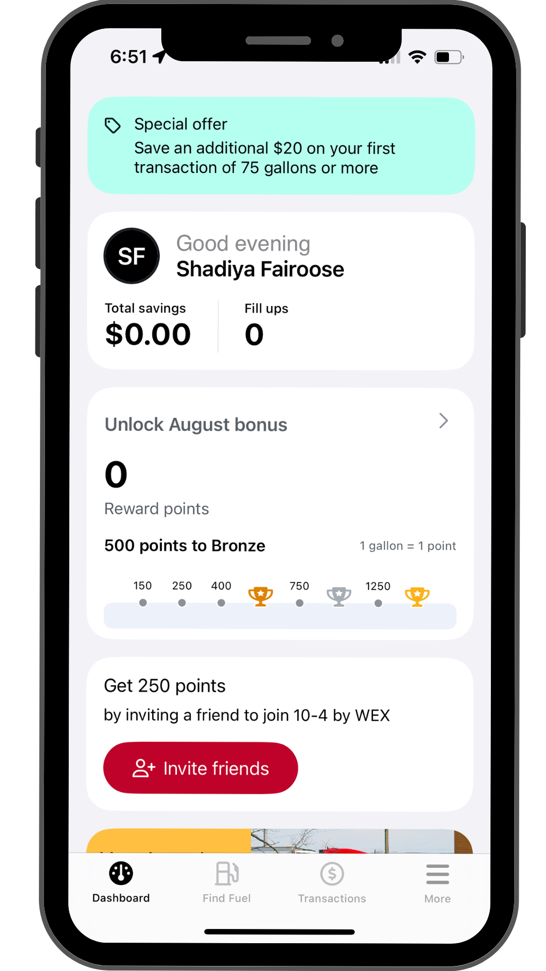
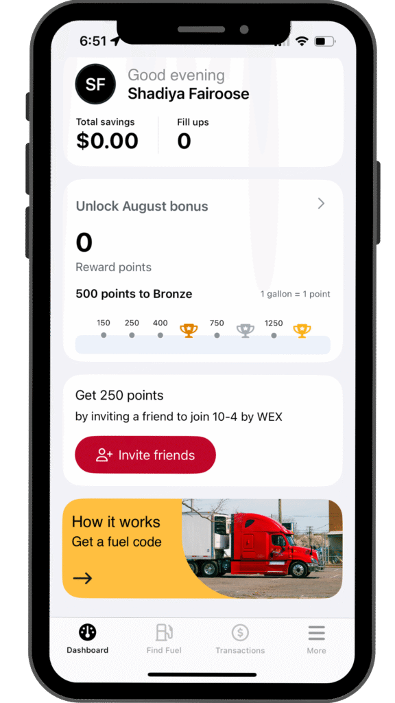
The Dashboard
We designed the dashboard to be the user’s mission control. We used a card-based layout to segment information, allowing drivers to quickly see their total savings, rewards progress, and special offers. This clean hierarchy, combined with a focused color palette, ensures the most critical information is immediately accessible without creating cognitive overload.
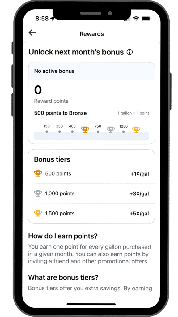
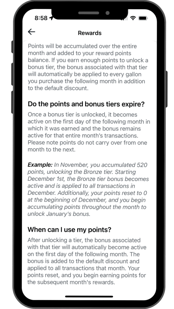
The Rewards Program To drive loyalty and reward our most active users, we introduced a tiered rewards program. The challenge was to make the rules, especially how and when bonuses are applied, incredibly simple to understand.
Visual Motivation: We designed a clear progress bar as the centerpiece of the screen. This gives drivers immediate feedback on their current points and shows them exactly how close they are to unlocking the next bonus tier, providing a constant source of motivation.
Transparent Tiers: The bonus tiers are displayed in a simple list, explicitly stating the points needed and the cents-per-gallon reward. This transparency removes any guesswork for the user.
Proactive Clarification: We knew the monthly point reset and “next month’s bonus” rule could be confusing. I designed the “How it works” and detailed Rewards FAQ screen to address this head-on, using plain language and a concrete example to ensure users understood the system perfectly.
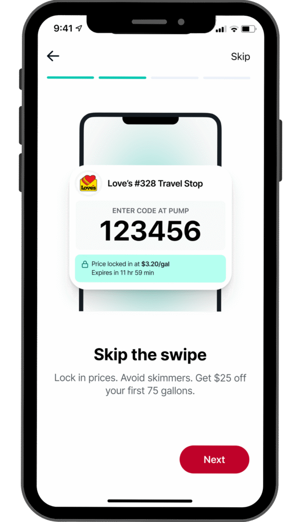
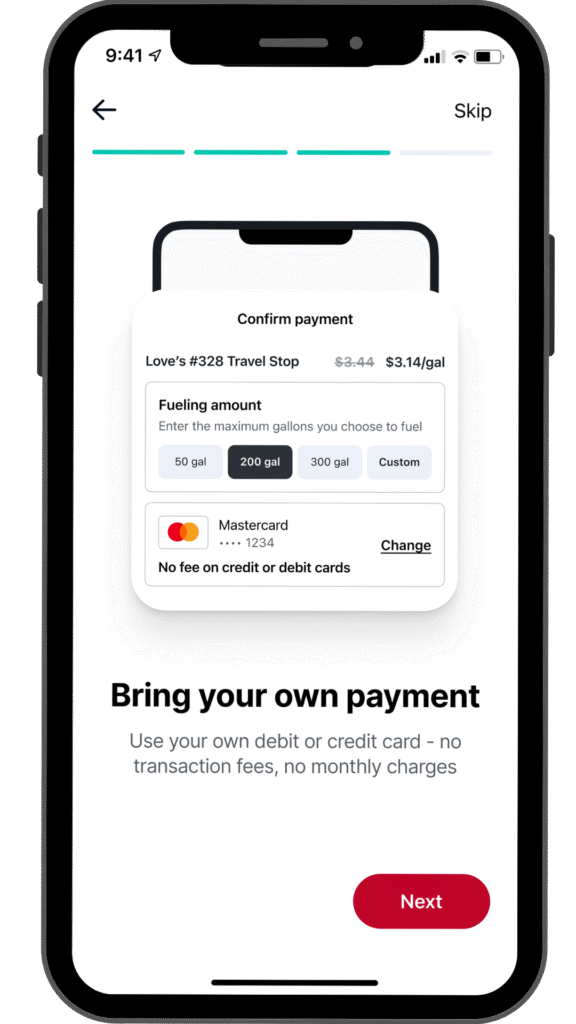
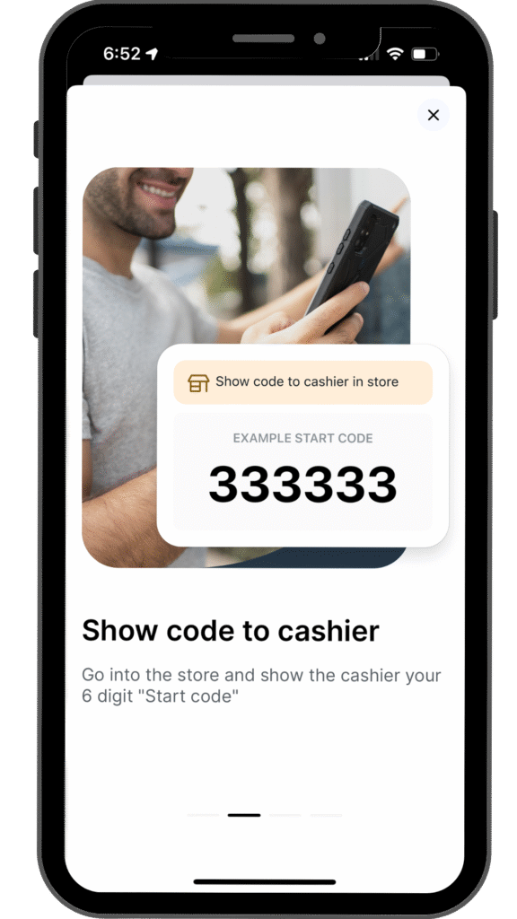
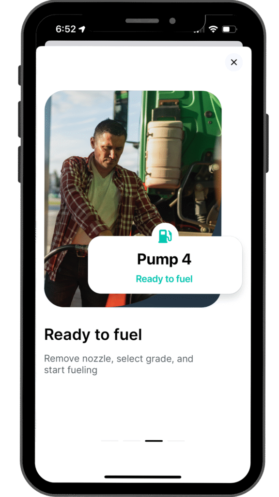
The fueling flow
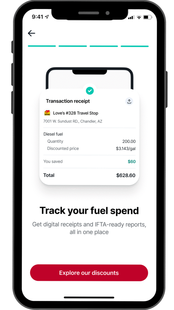
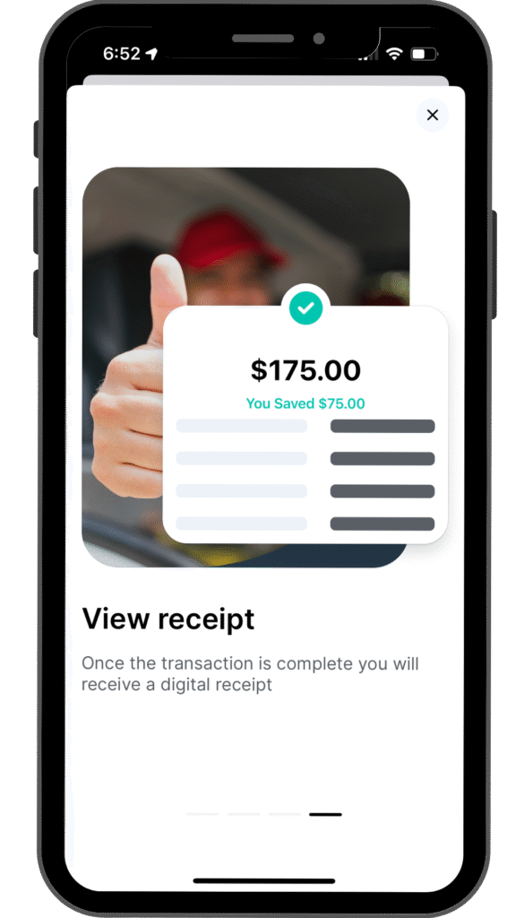
The core of the app is the process of getting and using a fuel code. We focused on designing a flow that felt secure and foolproof. This included using large, legible typography for the fuel code and providing clear, step-by-step instructions. The confirmation screens were designed to provide immediate positive feedback, especially the final screen, where displaying “You Saved $75.00” in a large, bold font reinforces the app’s value and creates a moment of satisfaction
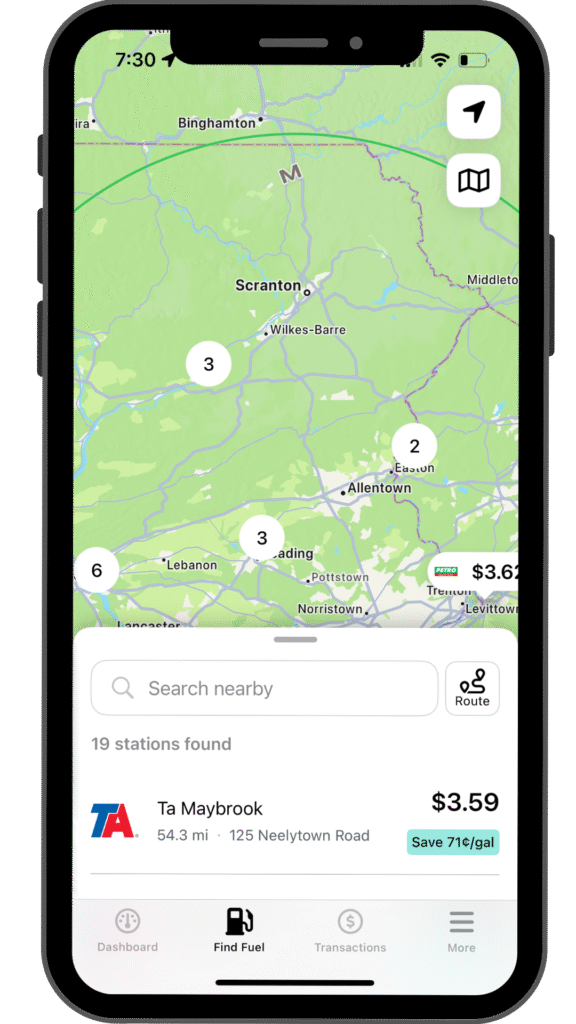
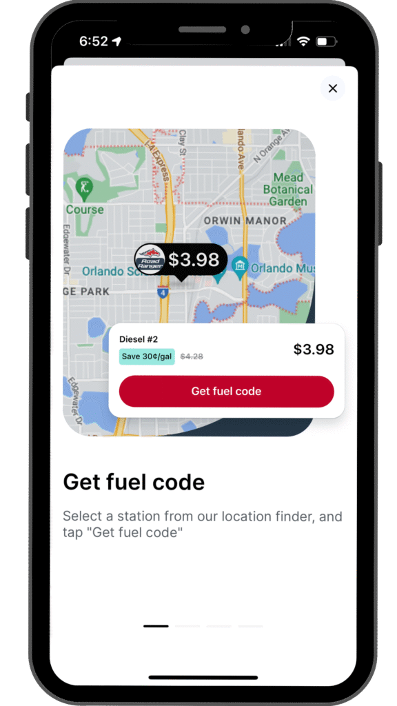
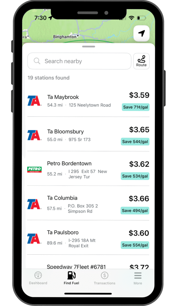
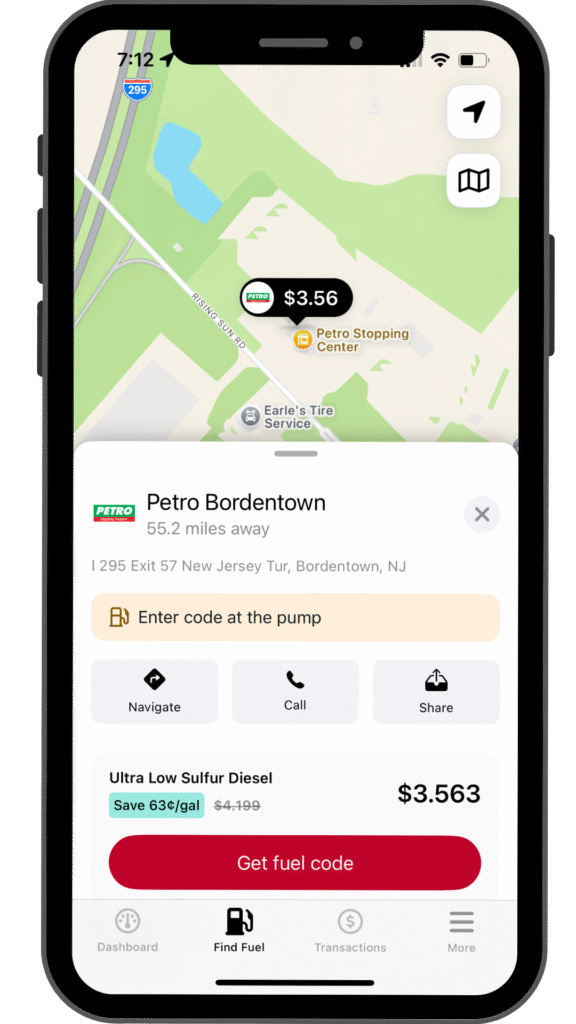
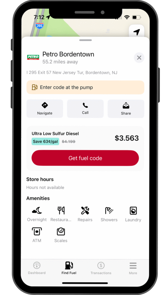
Finding fuel
Finding a fuel station needs to be effortless. I contributed to the design of the “Find Fuel” screen, which presents information in two ways: a map view for geographical context and a list view for easy price comparison. We made the price per gallon and the “Save X¢/gal” callout the most prominent elements, as this is the app’s core value proposition.
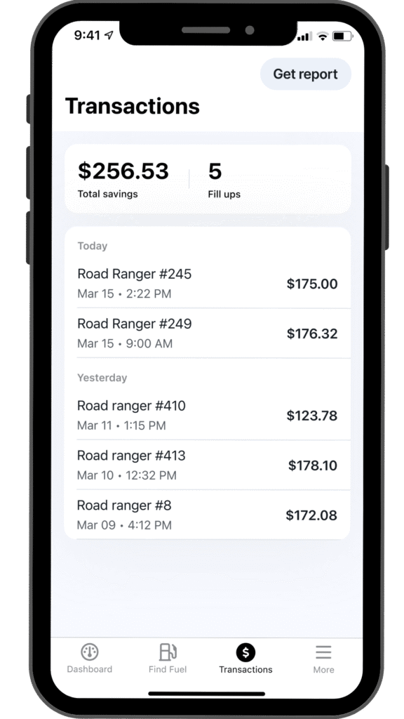
The transactions & savings hub
For a professional driver, tracking expenses is critical. We designed the transaction section to be more than just a history list; it’s a simple bookkeeping tool that constantly reinforces the app’s value.
At-a-Glance Summary: The top of the transaction list immediately displays the most important metrics: “Total savings” and “Fill ups.” This gives users a powerful, at-a-glance summary of the value they’ve received from the app.
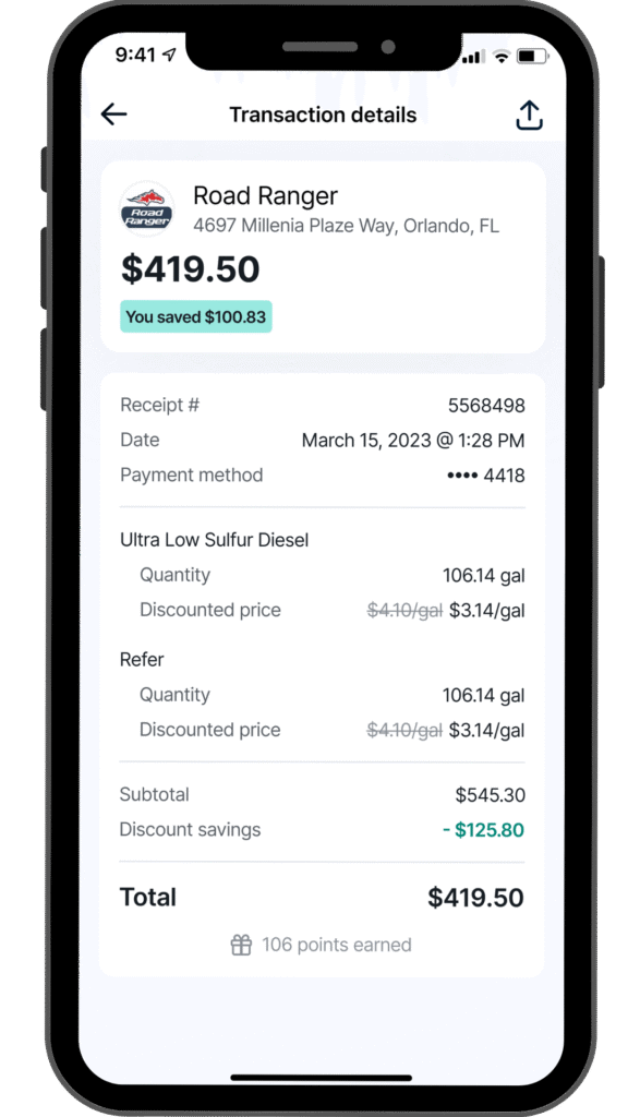
The Value-First Receipt: On the transaction detail screen, the most prominent element after the total cost is the green savings chip: “You saved $100.83.” This was a deliberate choice to provide immediate positive reinforcement.
Transparent Breakdown: The digital receipt is structured to be clear and transparent, showing the original price versus the discounted price. At the bottom, we close the loop by showing “points earned,” connecting the purchase back to the rewards program.
Collaboration and impact
With the lead designer
I worked in tandem with the lead designer to brainstorm and execute on the visual direction set by the product roadmap
With UX research
The partnership with our UX researcher was invaluable. User testing sessions directly informed our design decisions
With developers
I participated in handoff meetings where we presented our designs to the development team to ensure the output was pixel-perfect
FIN. Thanks for following the 10-4 by WEX design journey! ❤️
")