Assessing the usability of the Cooper Hewitt Museum website through Eye-Tracking testing
Abstract
Cooper Hewitt is the only museum in the United States devoted exclusively to historical and contemporary design and is the steward of one of the most comprehensive design collections in existence. Our client was interested in understanding the interaction of users within the specific pages of the website, along with a general framework of suggestions to upgrade the website dynamics to improve engagements. The broad-term expectations of said upgrade would be to maintain a consistent user experience through the website while providing a medium for marketing the museum to the target audience. We conducted an eye-tracking mobile interface study to evaluate the navigation system of the exhibition page and the about page of the website. We focused on general user behavior within the pages, the obstacles they faced when using the website for specific tasks, and their user stories during the process of placing bookings for events through the website. Based on our evaluation, we were able to infer that some changes were required to have an optimal user experience on these specific web pages.
My Team
Jessica Drozd
Shadiya Fairoose
Jun Kok
Zhichun Zhao
My Role
My contributions to the project ranged across all phases of the study. I helped design and plan the usability tests with the eye-tracking software after understanding the foundations of the eye-tracking software. I assisted in conducting the usability tests and analyzed the results to derive useful findings which were consolidated into recommendations aligned with the goals of the study. During the final phase of the project, I helped craft a slide deck for the final presentation to stakeholders which included side by side analysis of the problems we identified and recommendations suggested to help improve the user state of the website.
Designing the usability evaluation study based on the eye-tracking mechanics
Our Goal
After meeting with our clients and gaining a specific understanding of their needs, we set our goals for this study. On a high level, the goals were focused on the engagement of the Exhibitions page and also the user journey involving the interaction of users within the page and subsequently the ease of the ticket reservation systems. We also wanted to learn how the users judged the content hierarchy, and figure out missing content and features as pointed out by users during their perusal of the site. Our other objective was to see if the users were able to navigate to the ‘About’ section of the website without external guidance. This was an issue suggested by the clients since they were previously aware of it but they were interested in how severe the problem was.
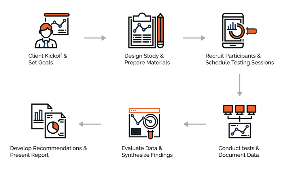
Designing the test plan and the script
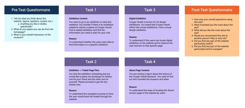
We designed a detailed script including the introduction, pre-task, tasks, and post-task questions. Our tasks were focused on the main areas where we wanted to conduct our analysis, such as the ‘Exhibitions’ and ‘About’ page, and observe how the users engaged with those pages. After completion of the tasks, we got feedback from them about the experience. We showed them the recorded videos of the screens during their tests and asked them to go through their thought process. We then asked them to fill in The System Usability Scale (SUS) form.
Recruit Participants and Schedule Testing Sessions
Based on the meeting with the client, we defined the user personas to be individuals who are looking for resources on the website and people who are generally curious about the museum. We, therefore, decided to recruit participants within the young adult age group who would be inclined towards exhibitions and activities in museums. We were able to recruit a total number of 8 participants for our study. We conducted all the tests within two weeks of the timeline.
8/8 participants have visited museums before
100%
4/8 participants are students
50%
The average age of the
participants were 25
Challenges faced by our team
1
Technical Issues
Our team was the first one to utilize the mobile interface of the Tobii pro-eye-tracking usability testing software. We had limited knowledge about the software and its technicality. In the process of conducting tests we were also understanding the software in parallel, so it was a little time-consuming factoring in the learning curve.
2
Analyzing the data from Tobii pro
During our usage of the Tobii software, we were bombarded with an abundance of data points detailing all facets of user behavior. Isolating the relevant metrics to analyze the data was a bit of a challenge.
Analyzing the data
The team created a comprehensive problem list to describe every usability problem a user encountered when conducting the eye-tracking study on the Cooper Hewitt, Smithsonian Design Museum website. We organized the problems by the problems that were identified, the description, the page that the problem occurred on, the frequency of how many times the problem occurred amongst our participants, the severity rating we gave the problem based on Nielsen Norman’s Severity Rating for Usability Problems, and any memorable quotes users gave while conducting the eye-tracking study. After analyzing the usability testing evaluations, we condensed problems into a total of 9 problems.
Our overall findings of the website
Our findings were in line with the expected outcomes of the testing during the initial phase of the study. Aside from issues raised by users while performing the main tasks, the post-task questionnaire also indicated that users had the most difficulty navigating the website and finding information about exhibitions and sections of the museum. After completing the tasks, the overall impressions of the participants were divided. Participants said the website looked ‘fun’ and ‘interesting’ but at the same time they found it hard to navigate through the content. The SUS score of the website is also below average. Participants were frustrated that they could not find more relevant information in terms of user context about the museum. Based on this, we found some areas for improvement such as re-labeling and re-organization of some of the major severity level problems.
With all the data collected, we’re able to come up with four findings and develop actionable recommendations that best fit Cooper Hewitt’s goals.
SUS Score
0%
Participants Could Not Complete One Of The Tasks
0/8
Participants Would Recommend The Site
0%
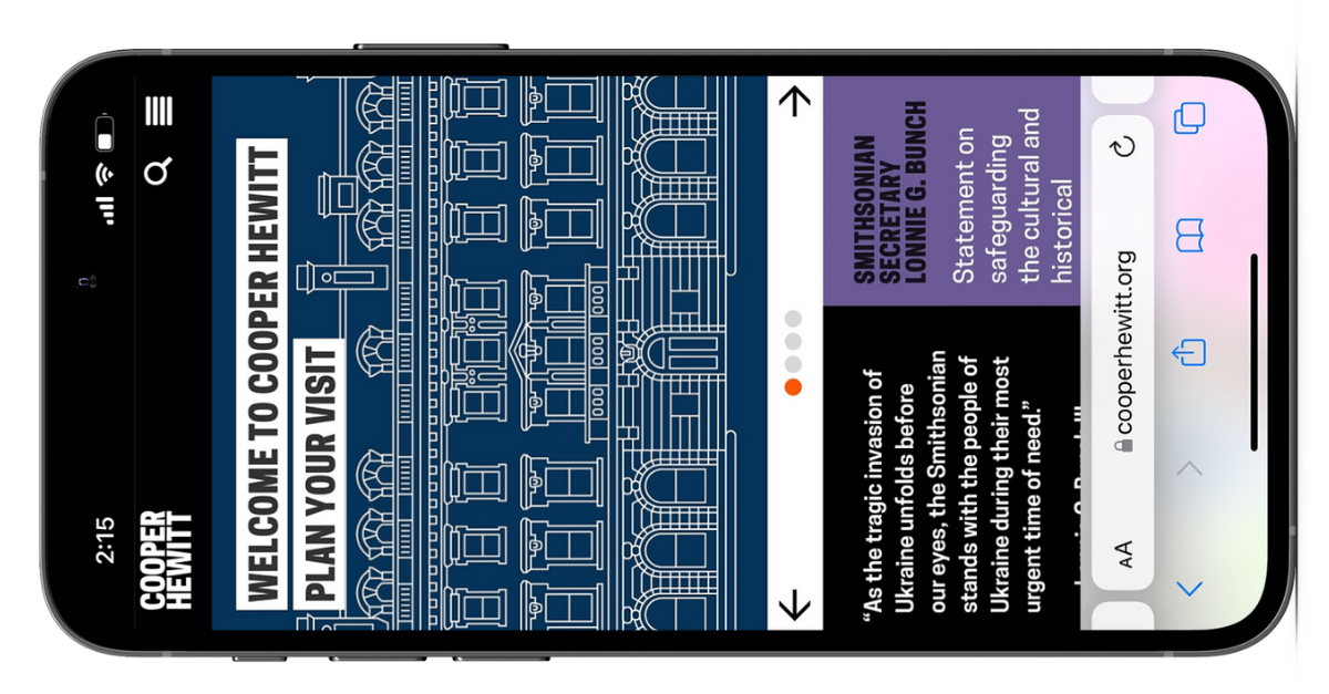
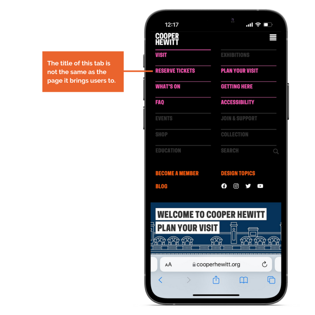
Finding 1: Participants could not find the ‘About’ section of the Cooper Hewitt
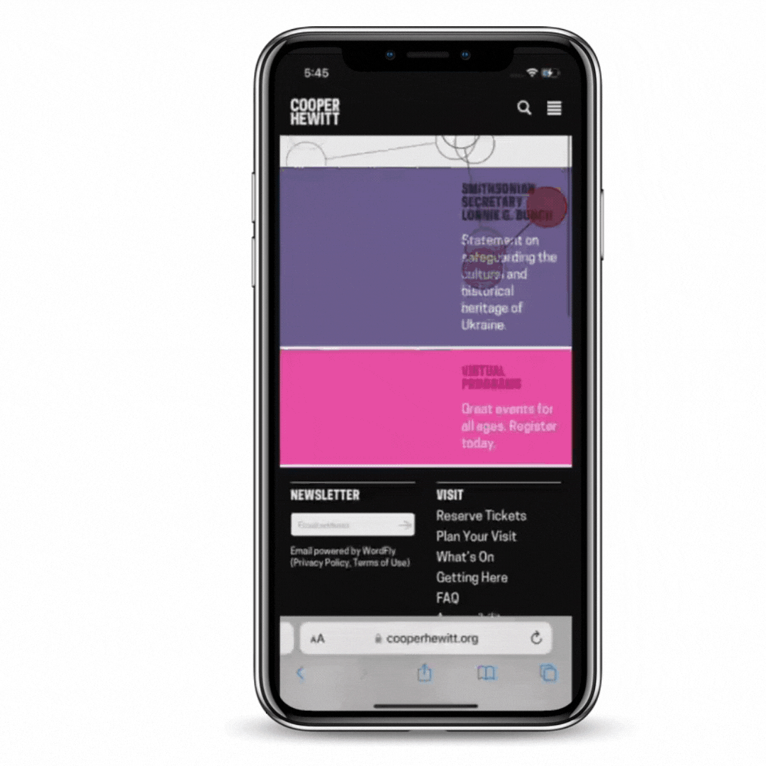
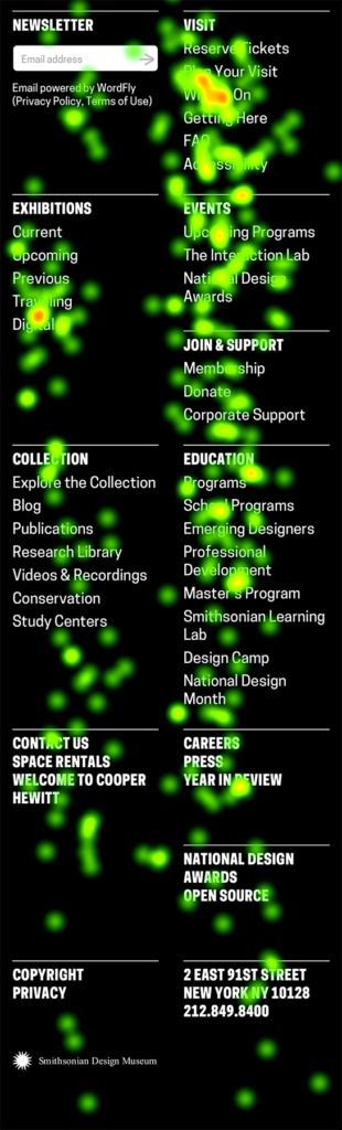
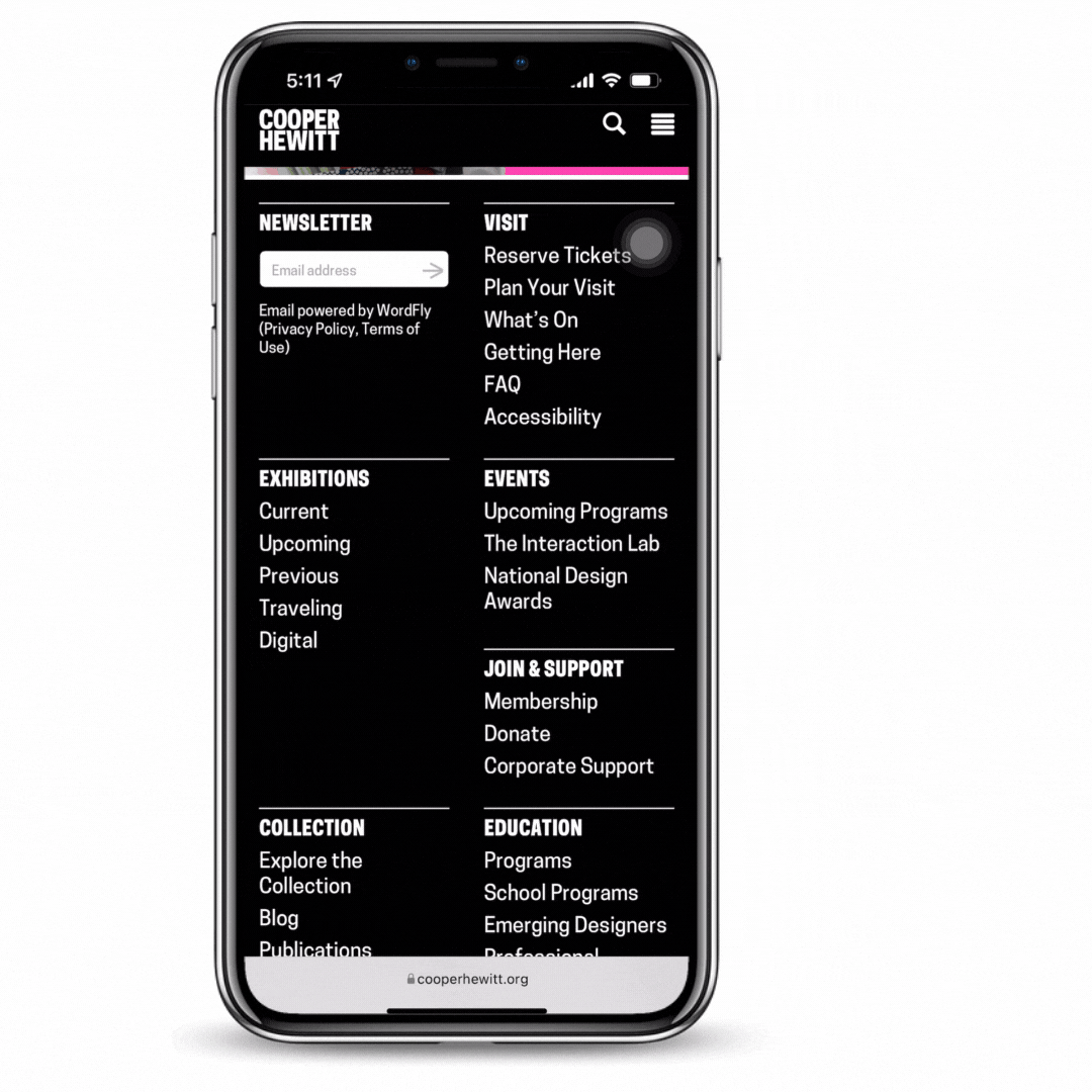
7/8 participants could not complete the 4th task (focused on the about section). Participants found this aspect particularly frustrating since this should be the most easily visible section, however, they all went back and forth throughout the home page and footer section to find it but were not successful. 4/8 participants also complained about the footer being too text-heavy. A participant said,
“This task was a little tricky because I assumed there should be an option ‘about us’ page or something about their history directly on their menu page (options).”
You can see below video one of the participants going back and forth throughout the home page
Footer section of the website
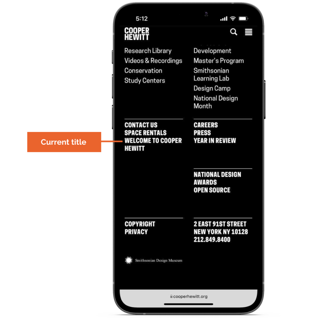
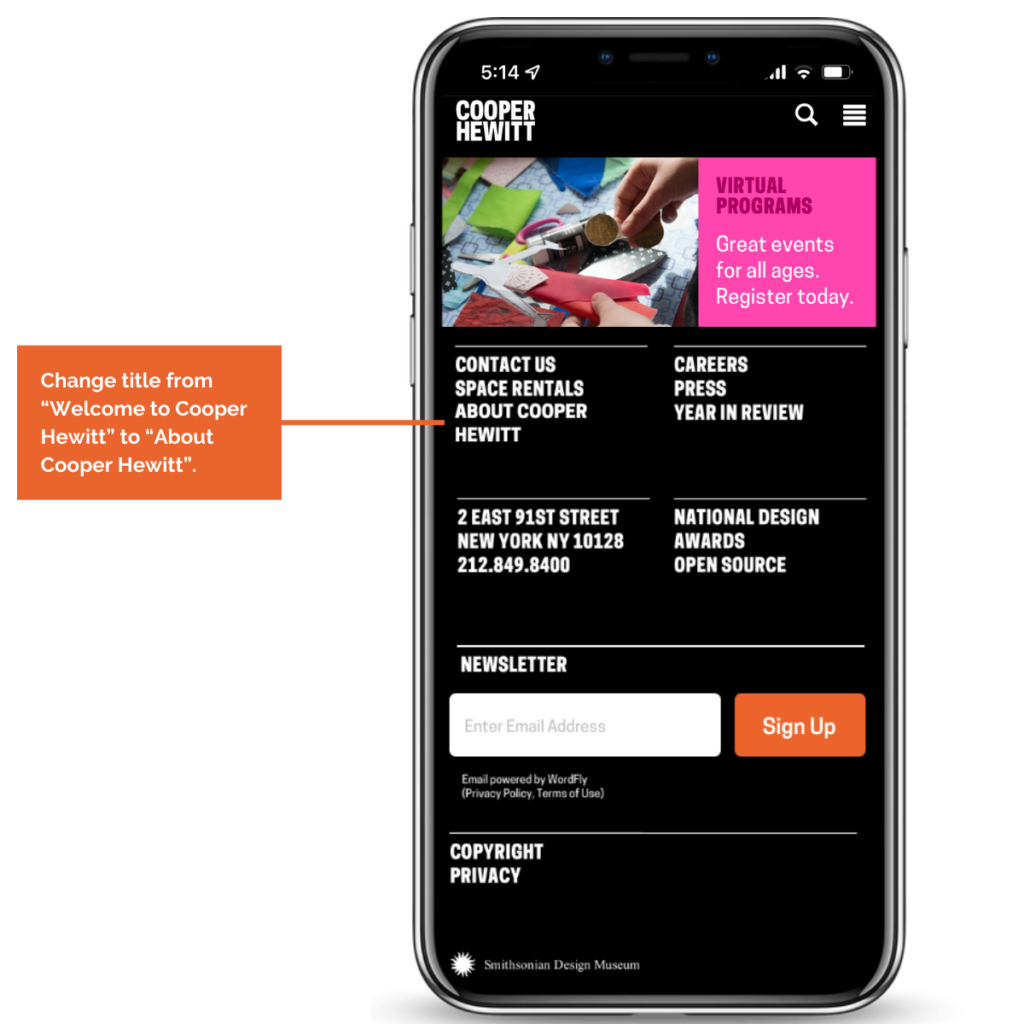
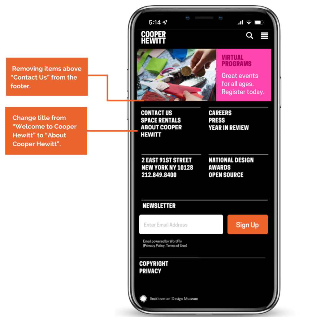
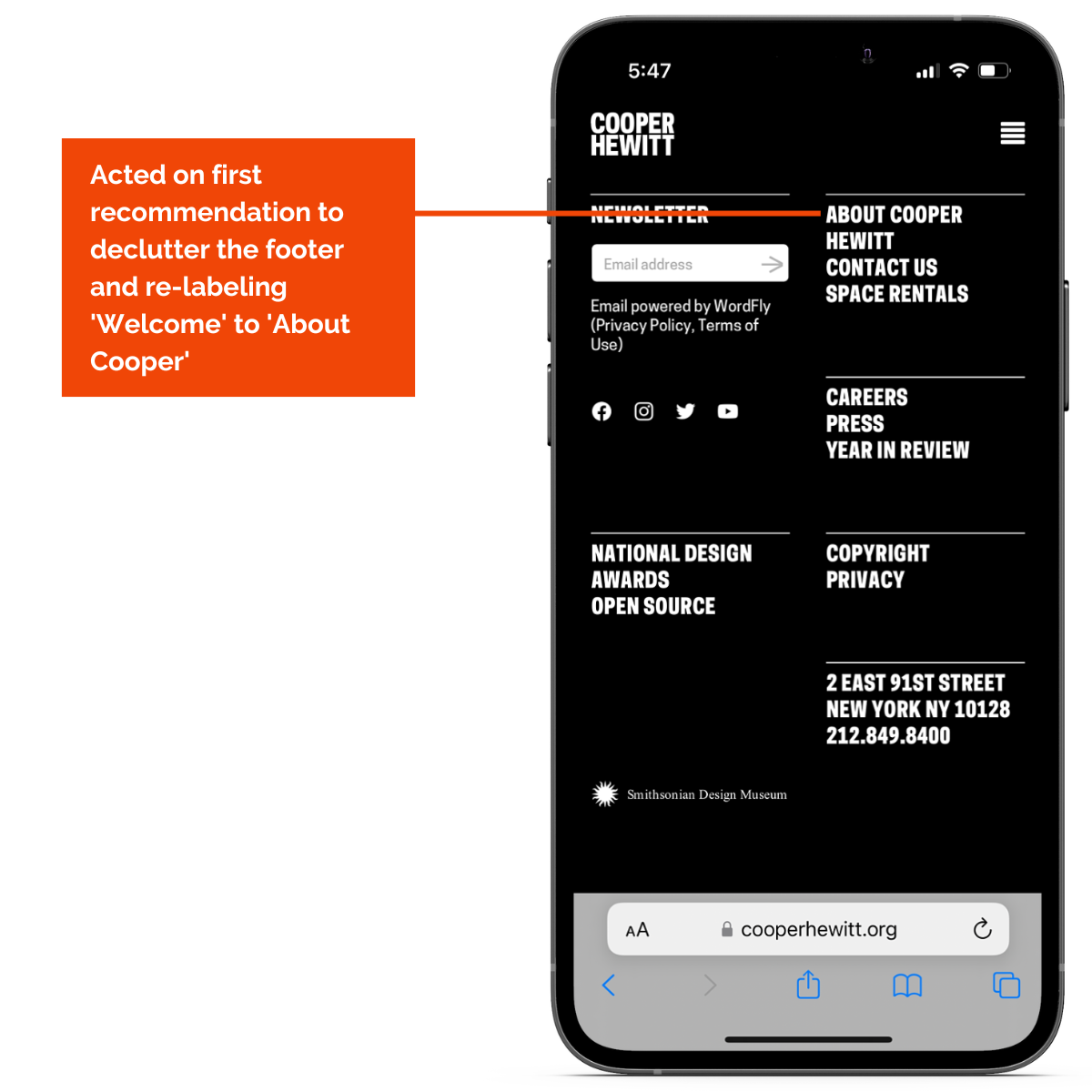
Recommendation 1.1: Re-label the footer section.
Rethink the names of certain items like changing “Welcome to Cooper Hewitt” to “About Cooper Hewitt” this makes it more straightforward, lets the users know what they are looking for, and reduces confusion.
Recommendation 1.2: Declutter the footer section.
Removing items above “Contact Us” from the footer. This information is found in the hamburger navigation which happens to be sticky so it does not need to be repeated and take up valuable real estate.
In the below video, you can see the current length of the footer
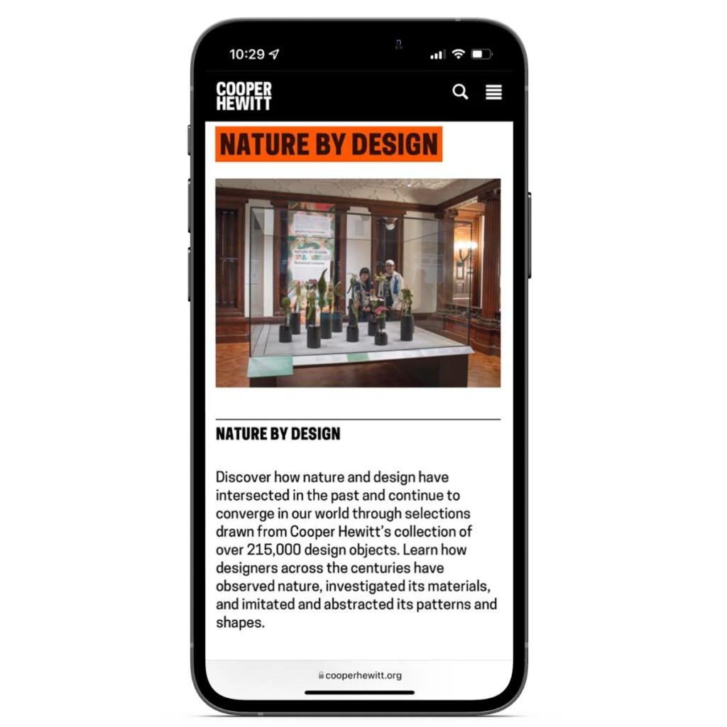
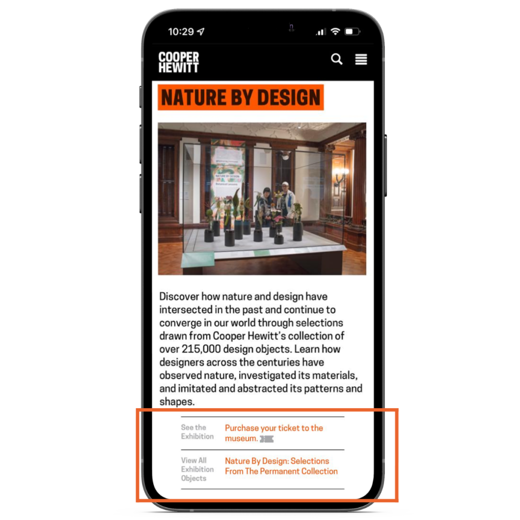
Finding 2: Participants could not find the ‘Purchase your ticket’ option on the Exhibition page
Participants went through the whole exhibition page to locate this option but the majority of them could not find it. 3/8 people scrolled to the bottom and clicked on the ‘Purchase Tickets’. Participant quoted:
“What frustrated me most is that I think there should be a ‘book exhibition’ button under the exhibitions, an introduction that would find me. That would bring me a much better experience if I can just book the days that the exhibition takes place instead of finding the date and time on my own in the ticket team center. “
In Video A, one of the participants went through the Exhibition page but was unable to find ‘Purchase your ticket’. In Video B, one of the three participants scrolled to the bottom and clicked on the ‘Purchase Tickets’
Video A
Video B
Recommendation: Move the ‘Purchase your ticket’ option to an easily viewable location
Since the Exhibition page is content-heavy, users tend to miss this option while scrolling through the page and conclude that they cannot reserve the tickets from the same page. The recommendation would be to push the “Purchase tickets” to the top of the exhibition page where it is easily accessible and viewable for the users to see, and also remove the ‘Reserve’ tickets from the top of the exhibition page to reduce redundancy.
Current Version
Mock-up Version
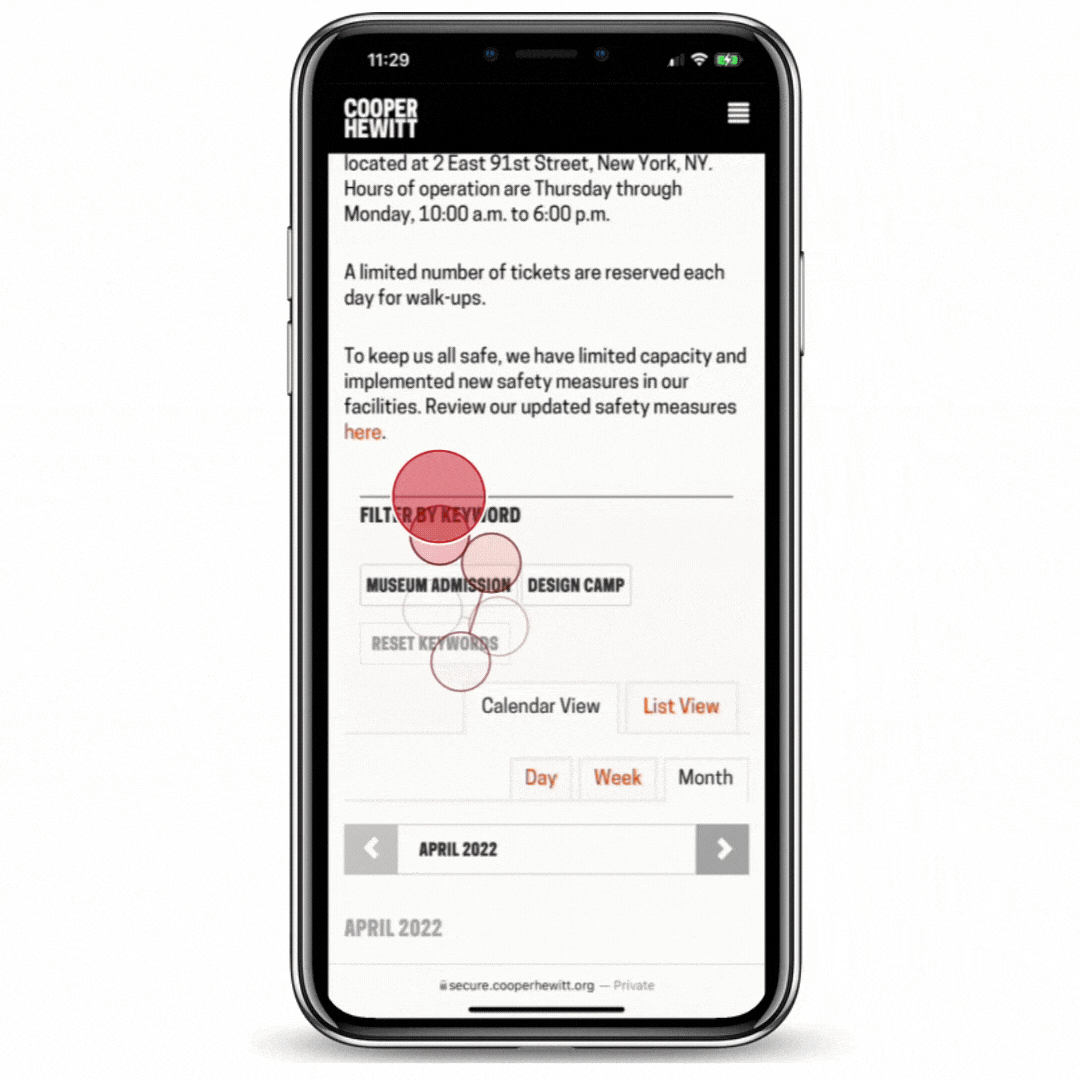
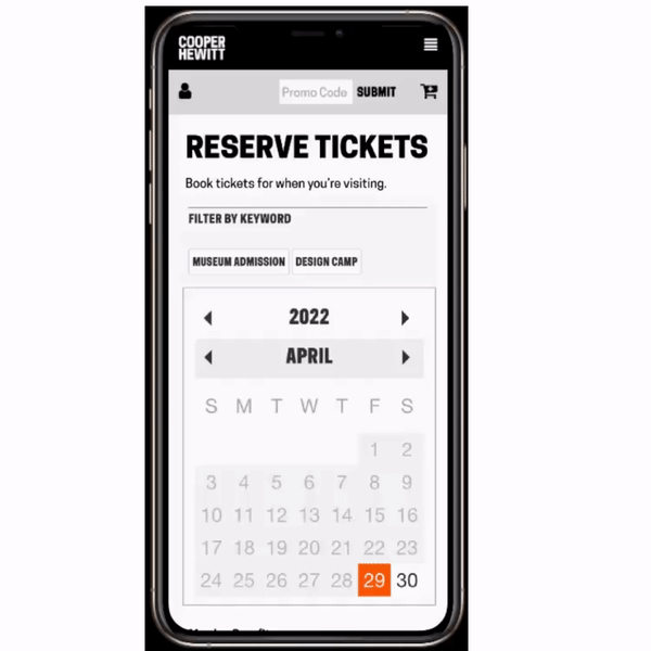
Finding 3.1: Current calendar view is confusing to users. The current layout puts a lot of cognitive burden on users due to how information is displayed.
The calendar for buying tickets does not provide an option for the day of the week, and no indication of what date the exhibitions are available to be seen on the calendar page. the Calendar view and List view are different, the options on the top initiate a filter by date option and the way it is presented can be overwhelming for users. Participant said,
“I forgot what day of the week it was. I would like to see a calendar view so I can just select it. It was a lot for me to figure out which date is attributed to each day.”
Partcipant searching for day of the week option
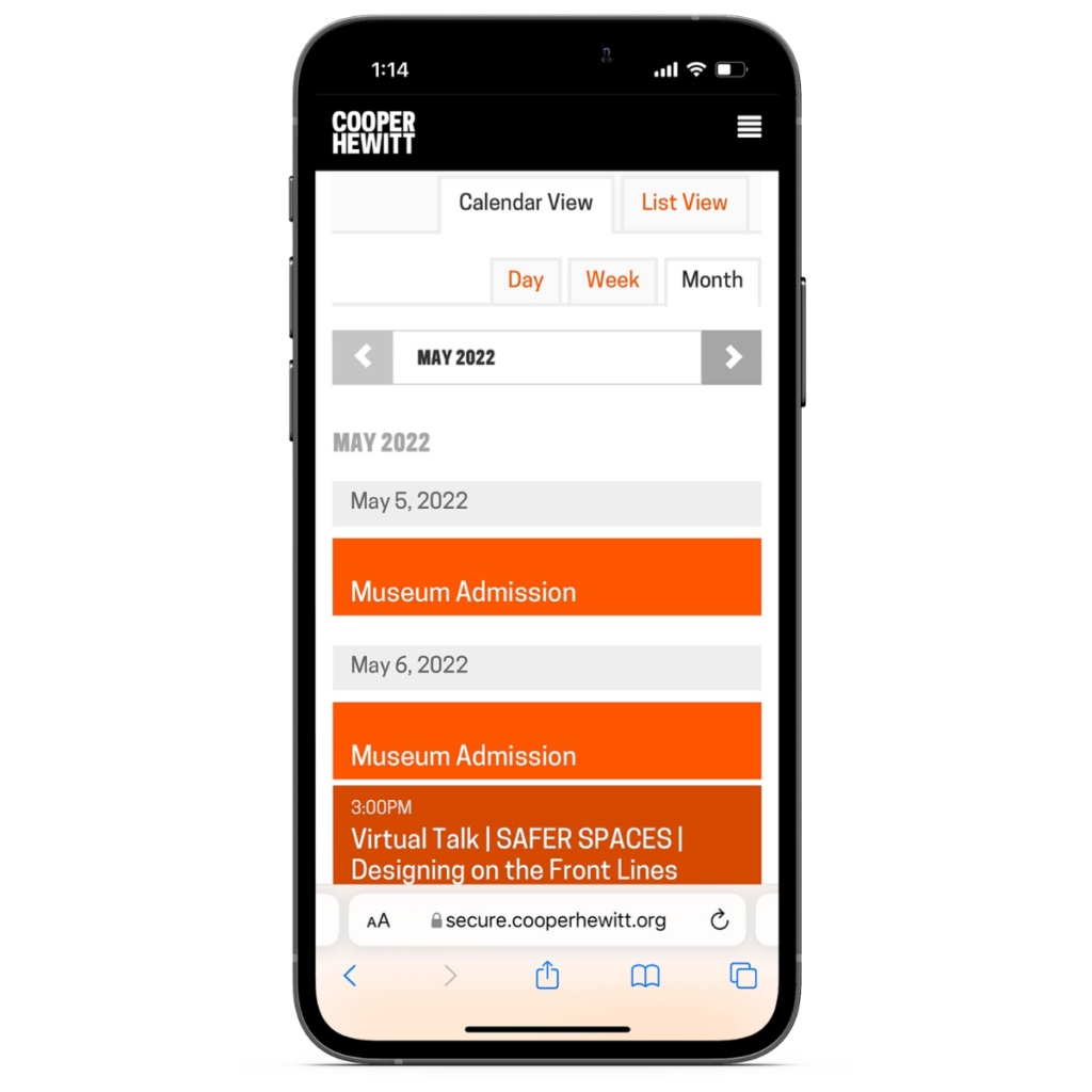
Recommendation: Re-style the calendar experience by changing the format of the booking
Show the available tickets in a monthly-style calendar, including the day of the week. This way it’s easier for the user to comprehend what day and date they want to book the tickets in a clear manner. The default style of the calendar option would also make the users less apprehensive about using the feature and optimize the experience.
Our recommended visual structure for ticket purchasing: Choose Year/Month/Day, Choose Time of Day, and Select Ticket Amount. And should be laid out entirely only on one page.
Current Version
Mock-up Version
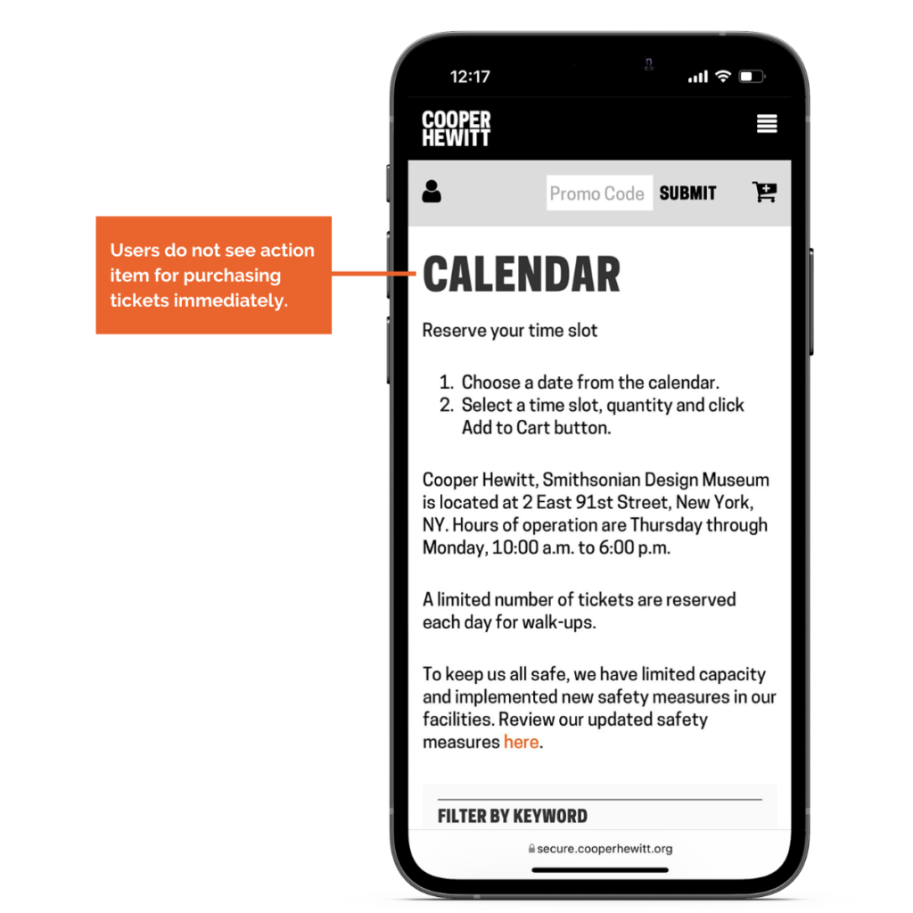
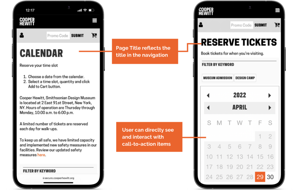
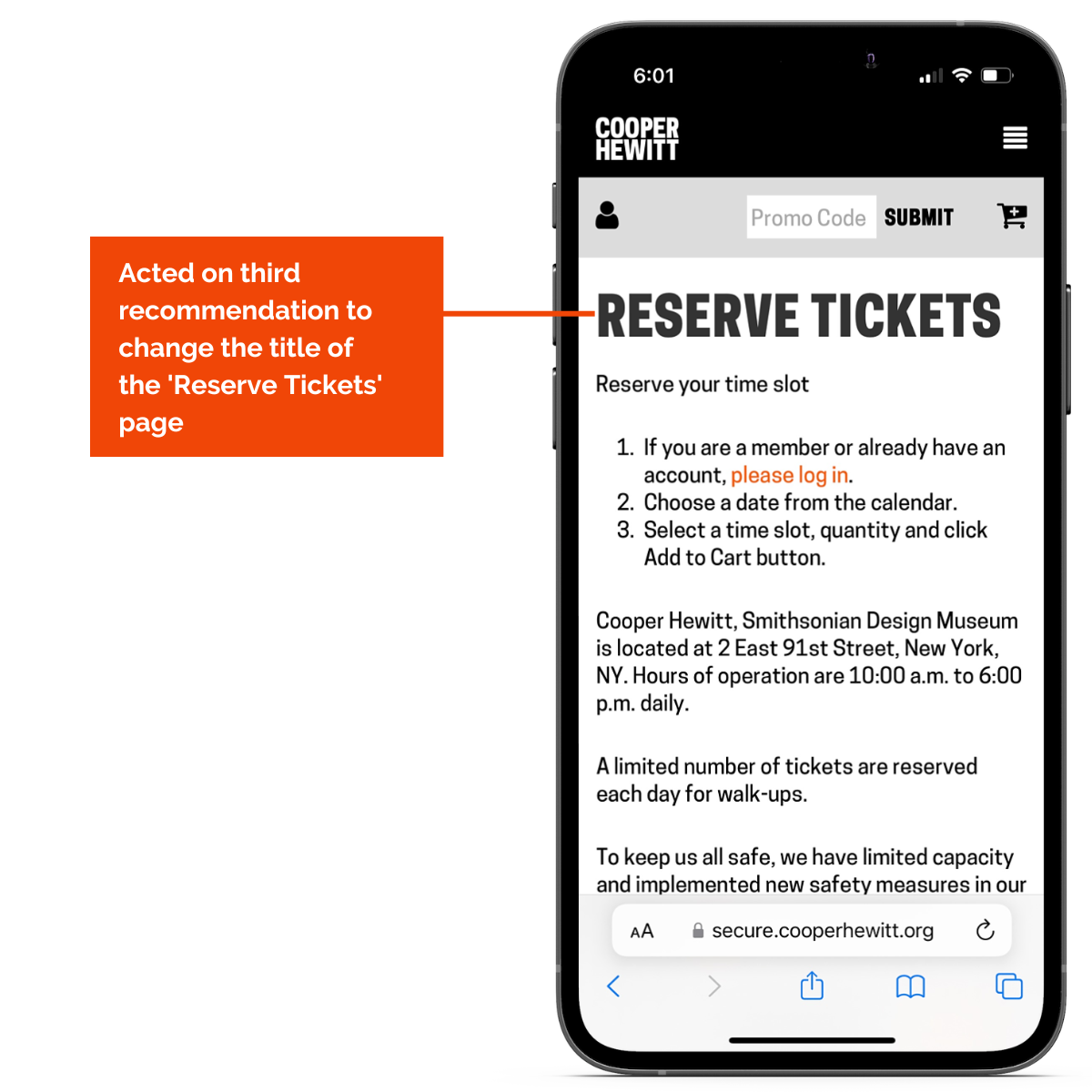
Finding 3.2: Participants find the ‘Reserve Tickets’ page not clear and concise.
The title of the page ‘Calendar’ can be misleading at times. When you click on ‘Reserve Tickets’ from the menu bar option, the page takes you to a title that says ‘Calendar. Participant said,
“There are no highlights or any indication to show this is an important page for ticketing”
Recommendation: Change the title of the ‘Reserve Tickets’ page
It is recommended to change the title of the page to a more straightforward and easy-to-understand terminology. This way it reduces the confusion among the users. The title of the page should be updated to a more relevant title such as ‘Book Tickets’ or ‘Reserve Tickets’
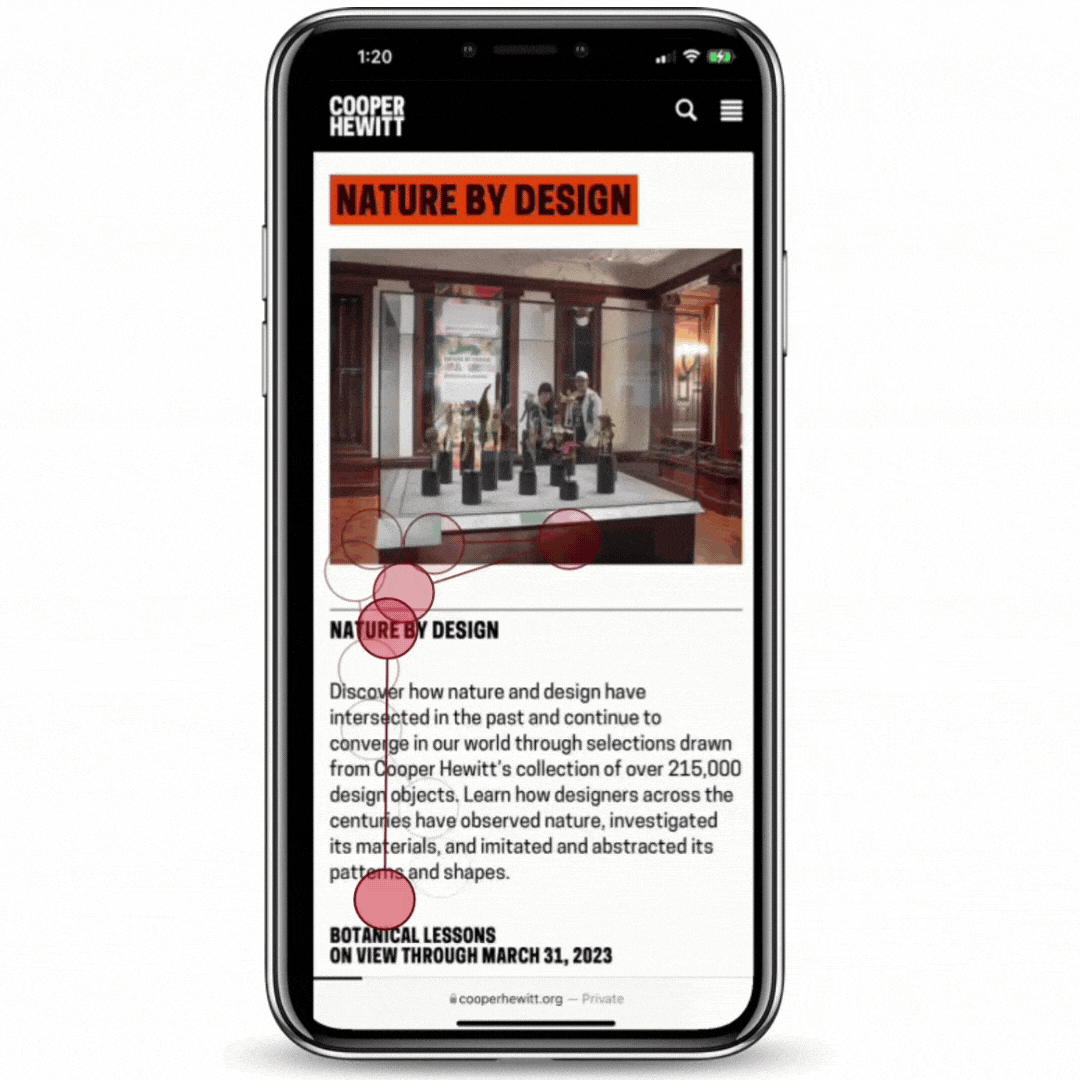
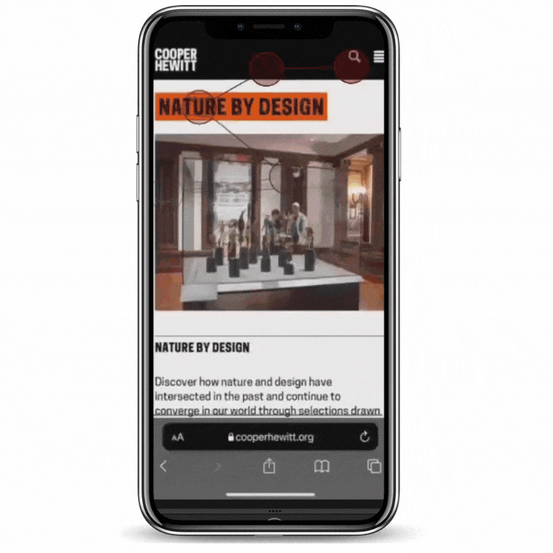
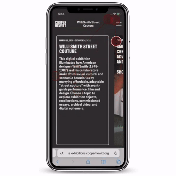
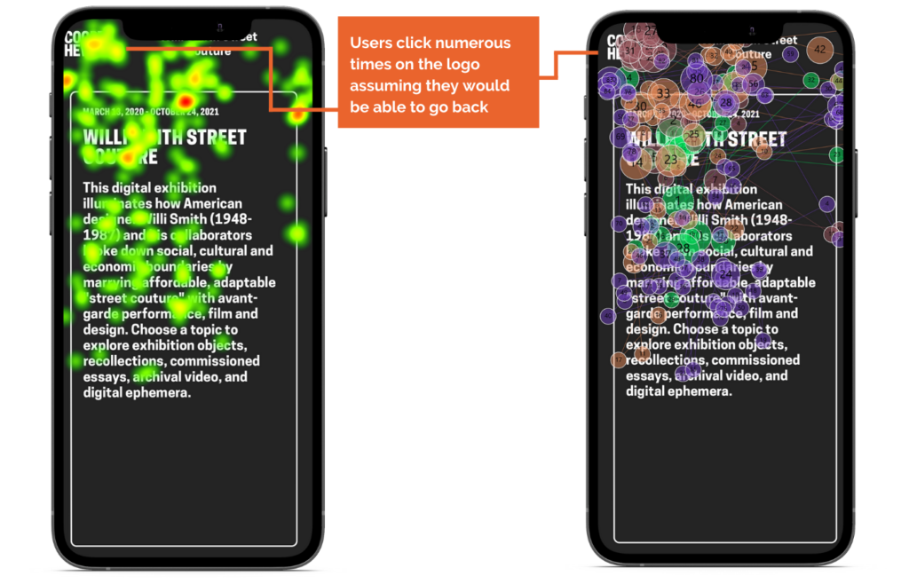
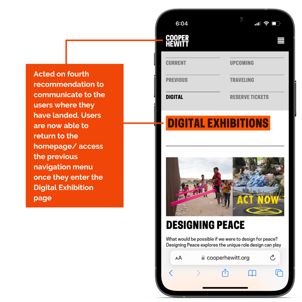
Finding 4: Letting the users know they have exited the main Cooper Hewitt page from the Digital Exhibition page.
8/8 Users aren’t able to return to the homepage/ access the previous navigation menu once they enter the Digital Exhibition page. In fact, once they click on the digital exhibition, they do not realize that they have exited the main Cooper Hewitt page and they click numerous times on the logo assuming they would be able to go back. They also try the hamburger menu but find it futile since the navigation menu is part of an entirely different section now.
One of the users clicking numerous times on the Cooper Hewitt logo
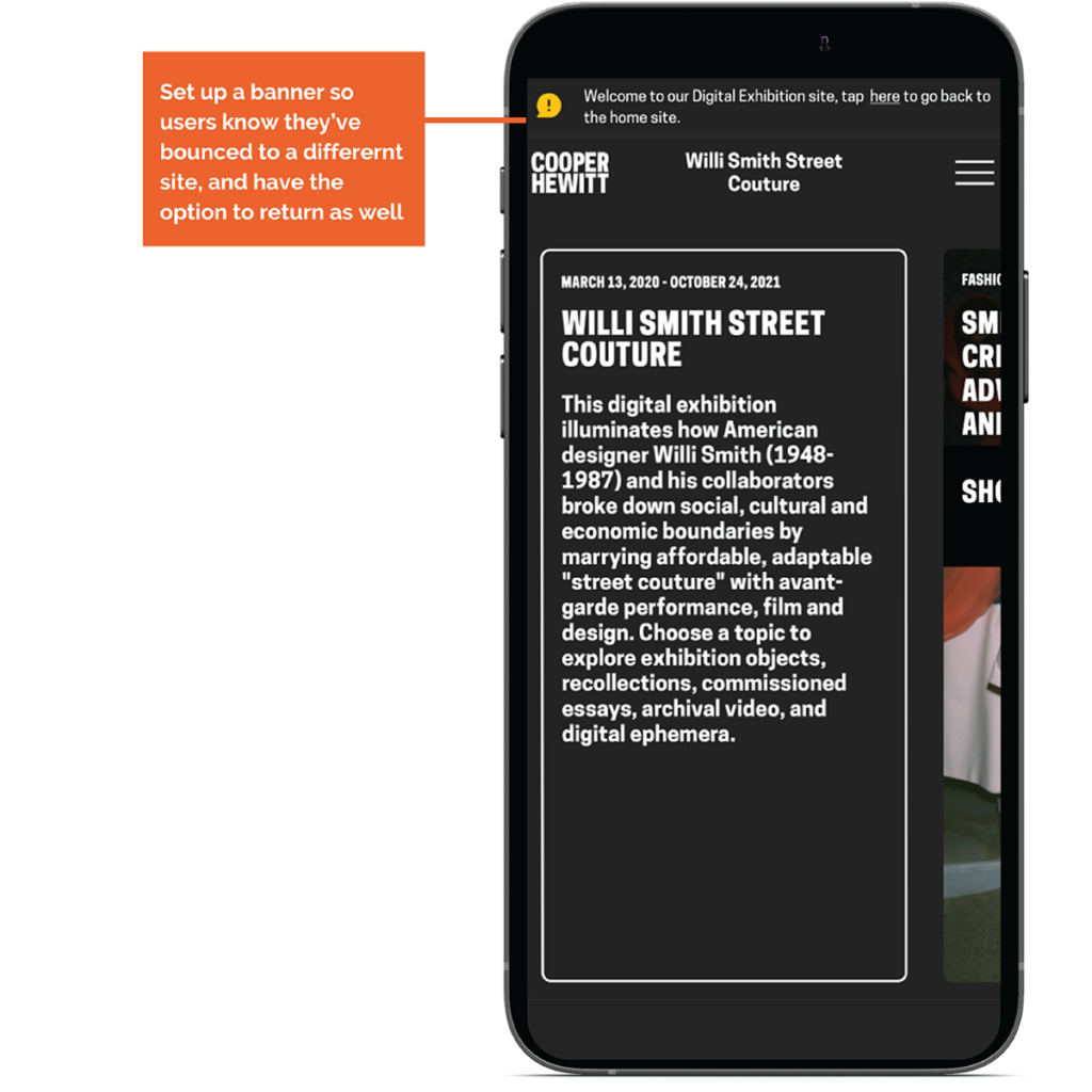
Recommendation: Communicate to the users where they have landed
Add a small banner on the top of the main page saying that they are no longer on the Cooper Hewitt main website and add a ‘click here’ button linked to the main Cooper Hewitt home page. This way there is proper communication letting the users know where they exactly are, and they realize how to go back.
So How did we get the word out?
As a group, we created a detailed presentation on the analysis process and the final results. The presentation can be viewed here.
This was presented to the clients over a Zoom meeting by the four of us, with some time for Q&A after.
The results were also created in the Highlights Reel. This can be viewed here.
Client Reaction
Turning insights into execution
Our recommendations were in line with the clients expectations and their reactions were highly positive. They mentioned the importance of terminology and their suspicion of navigational issues on the website due to related issues, so they were happy to see their hypothesis tested and confirmed through the usability evaluation. They were also happy to see the recommended changes to the calendar page, highlighting the new format and the potential in improving user engagements through it.
“That really was quite eye-opening, and your fix makes so much sense. We are appreciative of all of this valuable work”
So how do we move forward to maintain consistency in user engagement?
We’ve learned a lot from the process of conducting eye-tracking evaluation testing. However, while our recommendations are backed by the data that we have collected, it is difficult the quantify their effectiveness in the long term. The implementation of these recommendations should definitely yield some changes in the website’s user engagement. If it were to change, monitoring the numbers through applicable metrics would help create a feedback process which would be a long-term solution. We would like to conduct a follow-up website analytics process to check on the users’ interactions with the website. Furthermore, we would like to use Hotjar to collect click heatmap data and also analyze some of the recordings to further scrutinize the user behavior.
What were the constructive lessons I learned from the study?
I conducted my very first in-person user interview during this study. It was a great learning experience and I understood the basics of interacting with participants while conducting the tests. Having gone through such a process, I realized communication ethics is an important skill you need to have under your belt to be a successful UX researcher. Working with new tools such as Tobii pro and analyzing the related data helped me build new technical skills that will come in handy during the rest of my career. Finally, as always, I improved my collaboration skills with my amazing team without whom I would not be able to assess this study successfully.